Kamis, 24 Oktober 2013

4 Syarat Bisa Pakai BBM di Android dan iPhone

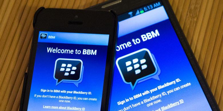
Tepat satu bulan dari waktu yang dijanjikan, BlackBerry akhirnya resmi merilis aplikasi BlackBerry Messenger (BBM) lintas platform, Selasa (22/10/2013).


Aplikasi yang sudah sangat ditunggu tersebut sudah bisa diunduh secara gratis di Google Play Store untuk platform Android dan Apple App Store untuk platform iOS.

Berikut panduan dan beberapa informasi singkat terkait BBM lintas platform ini.

1. Cek versi sistem operasi dan install

Sebelum menginstalasi aplikasi ini, ada baiknya Anda memperhatikan versi Android dan iOS terlebih dahulu.

BBM lintas platform hanya bisa berjalan di iPhone dengan iOS versi 6 ke atas dan ponsel Android merek apa pun asalkan telah menggunakan Android 4.0 ke atas (Ice Cream Sandwich dan Jelly Bean).

Sekadar catatan, aplikasi BBM baru bisa berjalan di perangkat ponsel saja. Artinya, BBM belum bisa berjalan di tablet Android dan iPad.

2. Unduh dan install

Cara termudah untuk mengunduh aplikasi BBM adalah dengan mengunjungi www.bbm.com melalui ponsel Android atau iPhone. Saat membuka situs tersebut melalui peramban, pengguna akan dibawa secara otomatis ke Google Play Store atau Apple App Store.

Jika tidak ingin melalui situs tersebut, Anda bisa mengunjungi tautan ini untuk platform iOS dan tautan ini untuk platform Android.

Cara untuk mengunduh aplikasi BBM sama dengan cara mengunduh aplikasi lain. Pengguna hanya perlu menekan tombol "Install", aplikasi akan secara otomatis terunduh.

Waktu unduhnya tidaklah terlalu lama, karena file instalasi hanya sekitar 13 MB. Jika ingin mengunduh lebih cepat, sebaiknya gunakan jaringan WiFi.

3. Belum daftar? silakan antre

Setelah proses unduh dan instalasi selesai, pengguna sudah bisa langsung masuk ke aplikasi ini. Akan tetapi, saat ini BBM di Android dan iOS baru bisa digunakan oleh orang-orang tertentu saja, yaitu mereka yang sebelumnya telah mendaftar di situs BBM.com.Ketika pertama kali dibuka setelah diunduh, BBM akan menampilkan laman konfirmasi e-mail terlebih dahulu. Pengguna yang sudah mendaftar di BBM.com bisa memasukkan alamat e-mail yang dipakai untuk registrasi dan langsung dikirim ke laman "Sign In".

Sebaliknya, pengguna yang belum mendaftar dan baru saja hendak memasukkan e-mail saat itu akan dialihkan ke laman lain. Isinya memberi tahu agar "menunggu giliran" sebelum bisa mulai memakai BBM di iPhone dan Android.

Ketika giliran pengguna yang bersangkutan sudah tiba, BlackBerry akan mengirim e-mail dan pengguna diminta kembali mengonfirmasi lewat aplikasi BBM.

Untungnya, proses "menunggu giliran" ini tidak akan memakan waktu terlalu lama. Berdasarkan pengalaman KompasTekno, hanya dibutuhkan waktu sekitar 1 jam untuk proses tersebut.

4. Wajib punya BlackBerry ID

Untuk menggunakan aplikasi BBM di Android dan iPhone, pengguna harus memiliki akun BlackBerry ID. Dengan memasukkan akun ini, pengguna nantinya akan mendapatkan personal identification number (PIN) baru yang "menempel" ke akun.Jika sebelumnya sudah menggunakan ponsel BlackBerry dan sudah memiliki akun BlackBerry ID, Anda cukup memasukkan akun tersebut saat Sign In di aplikasi BBM pada perangkat Android atau iPhone.

Secara otomatis, seluruh kontak BBM akan ditransfer ke BBM di perangkat Android atau iPhone.

Dalam kasus ini, saat login di BBM Android atau iPhone, Anda akan mendapatkan PIN dan barcode baru. PIN ini akan selamanya melekat dengan akun BlackBerry ID. Jadi, tidak akan berubah selama Anda menggunakan BlackBerry ID yang sama.

Sekadar catatan, satu BlackBerry ID hanya dapat digunakan pada satu perangkat. Jika satu BlackBerry ID digunakan pada dua perangkat, maka salah satu perangkat tidak akan bisa menggunakan BBM.

Jika belum memiliki akun BlackBerry ID, Anda bisa membuatnya melalui perangkat Android atau iPhone. Hal tersebut juga bisa dilakukan melalui tautan ini.

Untuk membaca lebih lanjut mengenai BlackBerry ID, silakan mengunjungi tautan berikut ini.

Setelah memasukkan BlackBerry ID, pengguna sudah bisa langsung menikmati aplikasi BBM ini. Untuk berkirim pesan teks ke orang tertentu, tinggal pilih orang yang dituju di daftar kontak. Broadcast Message pun dimungkinkan.Fitur Group masih ada di aplikasi ini. Namun, anggota dari tiap Group dibatasi hingga 30 pengguna saja. Pengguna bisa menambahkan daftar teman di kontak dengan menggunakan PIN, NFC, barcode, e-mail, dan SMS.
(Sumber : www.tekno.kompas.com)

Resmi, BBM untuk Android dan iPhone Sudah Bisa Diunduh

Tepat satu bulan setelah tertunda, aplikasi BlackBerry Messenger (BBM) untuk Android dan iPhone akhirnya resmi diluncurkan kembali. Dalam sebuah publikasi di blog resmi BlackBerry yang dirilis pada Senin (21/10/2013), perusahaan mengumumkan aplikasi BBM lintas platform akan tersedia di Google Play Store, Apple App Store, dan Samsung App Stores dalam "beberapa jam ke depan". Aplikasi BBM untuk Android dan iPhone akan didistribusikan secara bertahap ke beberapa negara. Ini dilakukan BlackBerry untuk mengantisipasi lonjakan pengguna secara mendadak. Pantauan Kompas Tekno pada Selasa (22/10/2013) pukul 06.30 WIB, aplikasi BBM sudah bisa diunduh pengguna iPhone di Indonesia. Aplikasinya dapat diunduh dari App Store Indonesia atau melalui tautan ini. Begitu juga untuk BBM di Android. Aplikasinya sudah dapat diunduh dari Indonesia di Google Play Store atau melalui tautan ini. Namun, meski sudah bisa diunduh dan di-install, BBM untuk Android dan iPhone baru bisa digunakan oleh pengguna yang telah mendaftarkan diri sebelumnya di BBM.com. Pengguna yang belum terdaftar harus antre menanti giliran. Agar terdaftar dalam antrean, pengguna wajib memasukkan alamat e-mail-nya di tampilan awal aplikasi BBM yang sudah ter-install di perangkat masing-masing. BlackBerry akan mengirim notifikasi melalui e-mail yang didaftarkan saat layanan BBM sudah bisa digunakan oleh pengguna yang bersangkutan. Seperti diberitakan sebelumnya, BlackBerry menjanjikan kedatangan BBM untuk Android pada 21 September. Sementara untuk iPhone, aplikasi BBM sempat muncul pada 21 September di Apple App Store, tetapi ditarik kembali pada 22 September 2013. Penundaan ini disebut BlackBerry karena munculnya aplikasi BBM tak resmi untuk Android yang mengakibatkan gangguan teknis di server. Aplikasi BBM hanya bisa berjalan di iPhone dengan iOS versi 6 ke atas dan perangkat Android merek apa pun asalkan telah menggunakan Android 4.0 ke atas (Ice Cream Sandwich dan Jelly Bean). Pengguna iPhone dan Android dapat memanfaatkan BBM untuk mengirim pesan teks, foto, voice note, serta membuat grup diskusi berisi 30 kontak.
(Sumber : www.tekno.kompas.com)

Kamis, 05 September 2013

Point Blank Offline Download & Install

Fiture :
  • Clan
  • Season Battle Info
  • Special User Icon
  • Exp Point and Cash
  • Unlimited time battle
  • A.I Mode and New Map
  • Best Player Icon
  • Create Room On Clan Server
Materials :
Untuk memudahkan anda dalam mengelola server, Sangat berguna untuk newbie alat fiture ini. Anda dapat melihat pada gambar di atas dan anda tidak perlu mendownload server lagi. Karena file .exe dalamnya adalah ( PORTABLE ) 
Silahkan Download PB-ServerManager

Screenshot PB Offline :


Download Games Point Blank Offline New 2013
 (Sumber : mashiro-techno.blogspot.com)
 

Rabu, 04 September 2013

Harga dan Spesifikasi Playstation 3

PLAYSTATION 3
Game konsol satu ini memang sangat disenangi kalangan remaja khususnya di Indonesia, mulai awal keluar dengan seri SONY PLAYSTATION 1, SONY PLAYSTATION 2 hingga generasi terakhir SONY PLAYSTATION 3. Sama sih dengan admin power hingga sekarang masih suka main PS2 khususnya Burnout 3 Takedown 

Nah, kali ini admin power akan memberikan daftar harga PS 3 terbaru 2013 yang admin rangkum dari situs resmi PLAYSTATION 3. Langsung saja cek harga dibawah ini jika sobat power tertarik untuk membelinya :

Harga PLAYSTATION 3 Terbaru

Type PS3
Spesifikasi PLAYSTATION3
Harga (Rp)
PlayStation®3 500GB
CPU : Cell Broadband Engine™ | GPU :RSX™ | Audio output :LPCM 7.1 ch, Dolby Digital, Dolby Digital Plus, Dolby TrueHD, DTS, DTS-HD, AAC | Memory :256 MB XDR Main RAM, 256 MB GDDR3 VRAM | Hard disk :500 GB | Networking :Enternet (10BASE-T, 100BASE-TX, 1000BASE-T)X 1, IEEE 802.11 b/g, Bluetooth® 2.0 (EDR) | Controller :Wireless Controller (Bluetooth®) | Power :AC 110V/220-240V, 50/60 Hz | Power consumption :Approx. 190W | External dimensions :Approx 290 X 60 X 230 mm (width x height x length) | Mass :Approx 2.1 kg | Color : Garnet Red
3.699.999
PlayStation®3 500GB
CPU : Cell Broadband Engine™ | GPU :RSX™ | Audio output :LPCM 7.1 ch, Dolby Digital, Dolby Digital Plus, Dolby TrueHD, DTS, DTS-HD, AAC | Memory :256 MB XDR Main RAM, 256 MB GDDR3 VRAM | Hard disk :500 GB | Networking :Enternet (10BASE-T, 100BASE-TX, 1000BASE-T)X 1, IEEE 802.11 b/g, Bluetooth® 2.0 (EDR) | Controller :Wireless Controller (Bluetooth®) | Power :AC 110V/220-240V, 50/60 Hz | Power consumption :Approx. 190W | External dimensions :Approx 290 X 60 X 230 mm (width x height x length) | Mass :Approx 2.1 kg | Color : Azurite Blue
3.699.999
PlayStation®3 320GB
CPU : Cell Broadband Engine™ | GPU : RSX™ | Audio output : LPCM 7.1 ch, Dolby Digital, Dolby Digital Plus, Dolby TrueHD, DTS, DTS-HD, AAC | Memory : 256 MB XDR Main RAM, 256 MB GDDR3 VRAM | Hard disk : 2.5” Serial ATA, 320 GB | Networking : Enternet (10BASE-T, 100BASE-TX, 1000BASE-T)X1, IEEE 802.11 b/g, Bluetooth® 2.0 (EDR) | Controller : Wireless Controller (Bluetooth®) | Power : AC 110V/220-240V, 50/60 Hz | Power consumption : Approx. 250 W | External dimensions : Approx 290 X 65 X 290 mm | Mass : Approx 3.2 kg | Color : Spalsh Blue
3.499.999
PlayStation®3 320GB
CPU : Cell Broadband Engine™ | GPU : RSX™ | Audio output : LPCM 7.1 ch, Dolby Digital, Dolby Digital Plus, Dolby TrueHD, DTS, DTS-HD, AAC | Memory : 256 MB XDR Main RAM, 256 MB GDDR3 VRAM | Hard disk : 2.5” Serial ATA, 320 GB | Networking : Enternet (10BASE-T, 100BASE-TX, 1000BASE-T)X1, IEEE 802.11 b/g, Bluetooth® 2.0 (EDR) | Controller : Wireless Controller (Bluetooth®) | Power : AC 110V/220-240V, 50/60 Hz | Power consumption : Approx. 250 W | External dimensions : Approx 290 X 65 X 290 mm | Mass : Approx 3.2 kg | Color : Scarlet Red
3.699.999
PlayStation®3 120GB
CPU : Cell Broadband Engine™ | GPU : RSX™ | Audio output : LPCM 7.1 ch, Dolby Digital, Dolby Digital Plus, Dolby TrueHD, DTS, DTS-HD, AAC | Memory : 256 MB XDR Main RAM, 256 MB GDDR3 VRAM | Hard disk : 2.5” Serial ATA, 120 GB | Networking : Enternet (10BASE-T, 100BASE-TX, 1000BASE-T)X1, IEEE 802.11 b/g, Bluetooth® 2.0 (EDR) | Controller : Wireless Controller (Bluetooth®) | Power : AC 110V/220-240V, 50/60 Hz | Power consumption : Approx. 250 W | External dimensions : Approx 290 X 65 X 290 mm | Mass : Approx 3.2 kg | Color : Charcoal Black
___
 (Sumber : www.hargaku.com)

Cara Menambah RAM Komputer Dengan Flashdisk

Menambah RAM Komputer Dengan Flashdisk - Memori Akses Acak atau Random Access Memory, (RAM) adalah sebuah tipe penyimpanan komputer yang isinya dapat diakses dalam waktu yang tetap tidak memperdulikan letak data tersebut dalam memori. Ini berlawanan dengan alat memori urut, seperti tape magnetik, disk dan drum, di mana gerakan mekanikal dari media penyimpanan memaksa komputer untuk mengakses data secara berurutan.
Ada 2 cara yang saya ketahui untuk menambah RAM menggunakan Flashdisk yaitu menggunakan Software dan tanpa Software. kelebihan dalam menggunakan software yaitu prosesnya akan otomatis dan sangat mudah. jika manual atau tanpa software maka akan sedikit rumit.
Cara pertama yaitu menggunakan software eBoostr. Dengan menggunakan eBoostr prosesnya cachenya akan berjalan otomatis. Sebagai catatan penting yang perlu diperhatikan bahwa jika flash disk digunakan sebagai penambah ram maka flash disk tersebut tidak bisa digunakan lagi untuk menyimpan data.
Cara kedua yaitu tanpa menggunakan software atau manual. Langkah ini akan saya jelaskan berikut ini :
  • Pasangkan flashdisk anda ke komputer.
  • Klik kanan pada My Computer lalu pilih Properties.
  • Klik tab Advanced, lalu klik tombol Settings pada kotak Performance.
  • Pada jendela yang muncul, klik tab Advanced lalu klik tombol Change pada kotakVirtual memory.
  • Pilih drive C, kemudian pilih No paging file. Jika sudah lanjutkan dengan mengklik tombol Set.
  • Pilih drive “flashdisk” anda (misalkan drive F), biasanya diberi nama Removable disk jika anda belum memberi nama pada flashdisk tersebut.
  • Setelah itu pilih System managed size dan dilanjutkan dengan mengklik tombol Set.
  • Perhatikan pada kotak Total paging file size for All drives. Nilai Recommended nya jangan melebihi kapasitas flashdisk.
  • Jika memang lebih maka anda bisa memasukkan “nilai total” dari kapasitas flashdisk. Caranya klik pilihan Custom Size lalu pilih Initial Size .
  • Maximum Size diisi dengan nilai total dari kapasitas flashdisk. Anda harus menyisakan 5 – 6 Mb. Ini merupakan persyaratan dari Windows XP itu sendiri. Jika sudah, klik tombol Set.
  • Kemudian Klik OK dan Restart Komputer
Artikel ini diambil dari http://smknegeri8semarang.com segala akibat yang timbul dari proses diatas bukan tanggung jawab penulis.

Tips Membuat Fullscreen Background Blog

Memasang wallpaper pada background blog kita,terlihat menarik dan unik.tapi menggunakan trik ini juga akan membuat blog sobat agak berat karena lamanya proses loading gambar yang akan ditampilkan.
tapi itu juga tergantung dari size gambar yang dijadikan background,saya sarankan sebelum mengupload dan memasang background,cari gambar yang ukuran filenya kecil(100-200kb),dan bila perlu,edit dulu gambarnya di photoshop menjadi kecil.contohnya blog saya sekarang,mungkin masih agak berat saat pertama kali buka blog saya,tapi kalau cache sudah tersimpan di browser kamu,maka otomatis tidak akan terlalu berat lagi saat membuka blog saya.sebelum mencoba trik ini,saya ingatkan untuk membackup terlebih dahulu template blogger kamu.

ok,yang pertama buka rancangan=> edit HTML,lalu copy kode html dibawah ini di bawah kode <body>

<ul class="cb-slideshow">
< li><span>Gambar 01</span><div><h3>textkamu1</h3></div></li>
< li><span>Gambar 02</span><div><h3>textkamu2</h3></div></li>
< li><span>Gambar 03</span><div><h3>textkamu3</h3></div></li>
< li><span>Gambar 04</span><div><h3>textkamu4</h3></div></li>
< li><span>Gambar 05</span><div><h3>textkamu5</h3></div></li>
< li><span>Gambar 06</span><div><h3>textkamu6</h3></div></li>
< /ul>


#Note:kamu bisa mengganti pesannya pada tiap slide.


yang kedua,pilih/COPY SALAH SATU Style/CSS yang ada dibawah ini,Sesuai yang ada dicontoh.


Slide effect 1

.cb-slideshow,
.cb-slideshow:after {
position: fixed;
width: 100%;
height: 100%;
top: 0px;
left: 0px;
z-index: 0;
}
.cb-slideshow:after {
content: '';
background: transparent url(http://tympanus.net/Tutorials/CSS3FullscreenSlideshow/images/pattern.png) repeat top left;
}
.cb-slideshow li span {
width: 100%;
height: 100%;
position: absolute;
top: 0px;
left: 0px;
color: transparent;
background-size: cover;
background-position: 50% 50%;
background-repeat: none;
opacity: 0;
z-index: 0;
-webkit-backface-visibility: hidden;
-webkit-animation: imageAnimation 36s linear infinite 0s;
-moz-animation: imageAnimation 36s linear infinite 0s;
-o-animation: imageAnimation 36s linear infinite 0s;
-ms-animation: imageAnimation 36s linear infinite 0s;
animation: imageAnimation 36s linear infinite 0s;
}
.cb-slideshow li div {
z-index: 1000;
position: absolute;
bottom: 30px;
left: 0px;
width: 100%;
text-align: center;
opacity: 0;
color: #fff;
-webkit-animation: titleAnimation 36s linear infinite 0s;
-moz-animation: titleAnimation 36s linear infinite 0s;
-o-animation: titleAnimation 36s linear infinite 0s;
-ms-animation: titleAnimation 36s linear infinite 0s;
animation: titleAnimation 36s linear infinite 0s;
}
.cb-slideshow li div h3 {
font-family: 'BebasNeueRegular', 'Arial Narrow', Arial, sans-serif;
font-size: 240px;
padding: 0;
line-height: 200px;
}
.cb-slideshow li:nth-child(1) span {
background-image: url(https://blogger.googleusercontent.com/img/b/R29vZ2xl/AVvXsEimqzZpAX8QDWbtNsH2cjUrl2NYI6Ah7TIMwEGRvHzK0JiUkIgIWFaNvrmvnSuKRDU5vz5bUOFrW2uC2kcBzqV9cJ9FLpqMZeM3sW_t5TMFh9J57khBGG-0Llbz_pI5qALNoxPg0gLxKWs/s1600/sad_Saya_cosplay_Euphemia_li_Britannia.jpg)
}
.cb-slideshow li:nth-child(2) span {
background-image: url(https://blogger.googleusercontent.com/img/b/R29vZ2xl/AVvXsEimqzZpAX8QDWbtNsH2cjUrl2NYI6Ah7TIMwEGRvHzK0JiUkIgIWFaNvrmvnSuKRDU5vz5bUOFrW2uC2kcBzqV9cJ9FLpqMZeM3sW_t5TMFh9J57khBGG-0Llbz_pI5qALNoxPg0gLxKWs/s1600/sad_Saya_cosplay_Euphemia_li_Britannia.jpg);
-webkit-animation-delay: 6s;
-moz-animation-delay: 6s;
-o-animation-delay: 6s;
-ms-animation-delay: 6s;
animation-delay: 6s;
}
.cb-slideshow li:nth-child(3) span {
background-image: url(https://blogger.googleusercontent.com/img/b/R29vZ2xl/AVvXsEimqzZpAX8QDWbtNsH2cjUrl2NYI6Ah7TIMwEGRvHzK0JiUkIgIWFaNvrmvnSuKRDU5vz5bUOFrW2uC2kcBzqV9cJ9FLpqMZeM3sW_t5TMFh9J57khBGG-0Llbz_pI5qALNoxPg0gLxKWs/s1600/sad_Saya_cosplay_Euphemia_li_Britannia.jpg);
-webkit-animation-delay: 12s;
-moz-animation-delay: 12s;
-o-animation-delay: 12s;
-ms-animation-delay: 12s;
animation-delay: 12s;
}
.cb-slideshow li:nth-child(4) span {
background-image: url(https://blogger.googleusercontent.com/img/b/R29vZ2xl/AVvXsEimqzZpAX8QDWbtNsH2cjUrl2NYI6Ah7TIMwEGRvHzK0JiUkIgIWFaNvrmvnSuKRDU5vz5bUOFrW2uC2kcBzqV9cJ9FLpqMZeM3sW_t5TMFh9J57khBGG-0Llbz_pI5qALNoxPg0gLxKWs/s1600/sad_Saya_cosplay_Euphemia_li_Britannia.jpg);
-webkit-animation-delay: 18s;
-moz-animation-delay: 18s;
-o-animation-delay: 18s;
-ms-animation-delay: 18s;
animation-delay: 18s;
}
.cb-slideshow li:nth-child(5) span {
background-image: url(https://blogger.googleusercontent.com/img/b/R29vZ2xl/AVvXsEimqzZpAX8QDWbtNsH2cjUrl2NYI6Ah7TIMwEGRvHzK0JiUkIgIWFaNvrmvnSuKRDU5vz5bUOFrW2uC2kcBzqV9cJ9FLpqMZeM3sW_t5TMFh9J57khBGG-0Llbz_pI5qALNoxPg0gLxKWs/s1600/sad_Saya_cosplay_Euphemia_li_Britannia.jpg);
-webkit-animation-delay: 24s;
-moz-animation-delay: 24s;
-o-animation-delay: 24s;
-ms-animation-delay: 24s;
animation-delay: 24s;
}
.cb-slideshow li:nth-child(6) span {
background-image: url(https://blogger.googleusercontent.com/img/b/R29vZ2xl/AVvXsEimqzZpAX8QDWbtNsH2cjUrl2NYI6Ah7TIMwEGRvHzK0JiUkIgIWFaNvrmvnSuKRDU5vz5bUOFrW2uC2kcBzqV9cJ9FLpqMZeM3sW_t5TMFh9J57khBGG-0Llbz_pI5qALNoxPg0gLxKWs/s1600/sad_Saya_cosplay_Euphemia_li_Britannia.jpg);
-webkit-animation-delay: 30s;
-moz-animation-delay: 30s;
-o-animation-delay: 30s;
-ms-animation-delay: 30s;
animation-delay: 30s;
}
.cb-slideshow li:nth-child(2) div {
-webkit-animation-delay: 6s;
-moz-animation-delay: 6s;
-o-animation-delay: 6s;
-ms-animation-delay: 6s;
animation-delay: 6s;
}
.cb-slideshow li:nth-child(3) div {
-webkit-animation-delay: 12s;
-moz-animation-delay: 12s;
-o-animation-delay: 12s;
-ms-animation-delay: 12s;
animation-delay: 12s;
}
.cb-slideshow li:nth-child(4) div {
-webkit-animation-delay: 18s;
-moz-animation-delay: 18s;
-o-animation-delay: 18s;
-ms-animation-delay: 18s;
animation-delay: 18s;
}
.cb-slideshow li:nth-child(5) div {
-webkit-animation-delay: 24s;
-moz-animation-delay: 24s;
-o-animation-delay: 24s;
-ms-animation-delay: 24s;
animation-delay: 24s;
}
.cb-slideshow li:nth-child(6) div {
-webkit-animation-delay: 30s;
-moz-animation-delay: 30s;
-o-animation-delay: 30s;
-ms-animation-delay: 30s;
animation-delay: 30s;
}
/* Animation for the slideshow images */
@-webkit-keyframes imageAnimation {
0% { opacity: 0;
-webkit-animation-timing-function: ease-in; }
8% { opacity: 1;
-webkit-animation-timing-function: ease-out; }
17% { opacity: 1 }
25% { opacity: 0 }
100% { opacity: 0 }
}
@-moz-keyframes imageAnimation {
0% { opacity: 0;
-moz-animation-timing-function: ease-in; }
8% { opacity: 1;
-moz-animation-timing-function: ease-out; }
17% { opacity: 1 }
25% { opacity: 0 }
100% { opacity: 0 }
}
@-o-keyframes imageAnimation {
0% { opacity: 0;
-o-animation-timing-function: ease-in; }
8% { opacity: 1;
-o-animation-timing-function: ease-out; }
17% { opacity: 1 }
25% { opacity: 0 }
100% { opacity: 0 }
}
@-ms-keyframes imageAnimation {
0% { opacity: 0;
-ms-animation-timing-function: ease-in; }
8% { opacity: 1;
-ms-animation-timing-function: ease-out; }
17% { opacity: 1 }
25% { opacity: 0 }
100% { opacity: 0 }
}
@keyframes imageAnimation {
0% { opacity: 0;
animation-timing-function: ease-in; }
8% { opacity: 1;
animation-timing-function: ease-out; }
17% { opacity: 1 }
25% { opacity: 0 }
100% { opacity: 0 }
}
/* Animation for the title */
@-webkit-keyframes titleAnimation {
0% { opacity: 0 }
8% { opacity: 1 }
17% { opacity: 1 }
19% { opacity: 0 }
100% { opacity: 0 }
}
@-moz-keyframes titleAnimation {
0% { opacity: 0 }
8% { opacity: 1 }
17% { opacity: 1 }
19% { opacity: 0 }
100% { opacity: 0 }
}
@-o-keyframes titleAnimation {
0% { opacity: 0 }
8% { opacity: 1 }
17% { opacity: 1 }
19% { opacity: 0 }
100% { opacity: 0 }
}
@-ms-keyframes titleAnimation {
0% { opacity: 0 }
8% { opacity: 1 }
17% { opacity: 1 }
19% { opacity: 0 }
100% { opacity: 0 }
}
@keyframes titleAnimation {
0% { opacity: 0 }
8% { opacity: 1 }
17% { opacity: 1 }
19% { opacity: 0 }
100% { opacity: 0 }
}
/* Show at least something when animations not supported */
.no-cssanimations .cb-slideshow li span{
opacity: 1;
}

@media screen and (max-width: 1140px) {
.cb-slideshow li div h3 { font-size: 140px }
}
@media screen and (max-width: 600px) {
.cb-slideshow li div h3 { font-size: 80px }
}


Slide effect 2

.cb-slideshow,
.cb-slideshow:after {
position: fixed;
width: 100%;
height: 100%;
top: 0px;
left: 0px;
z-index: 0;
}
.cb-slideshow:after {
content: '';
background: transparent url(http://tympanus.net/Tutorials/CSS3FullscreenSlideshow/images/pattern.png) repeat top left;
}
.cb-slideshow li span {
width: 100%;
height: 100%;
position: absolute;
top: 0px;
left: 0px;
color: transparent;
background-size: cover;
background-position: 50% 50%;
background-repeat: none;
opacity: 0;
z-index: 0;
-webkit-backface-visibility: hidden;
-webkit-animation: imageAnimation 36s linear infinite 0s;
-moz-animation: imageAnimation 36s linear infinite 0s;
-o-animation: imageAnimation 36s linear infinite 0s;
-ms-animation: imageAnimation 36s linear infinite 0s;
animation: imageAnimation 36s linear infinite 0s;
}
.cb-slideshow li div {
z-index: 1000;
position: absolute;
bottom: 10px;
left: 0px;
width: 100%;
text-align: right;
opacity: 0;
-webkit-animation: titleAnimation 36s linear infinite 0s;
-moz-animation: titleAnimation 36s linear infinite 0s;
-o-animation: titleAnimation 36s linear infinite 0s;
-ms-animation: titleAnimation 36s linear infinite 0s;
animation: titleAnimation 36s linear infinite 0s;
}
.cb-slideshow li div h3 {
font-family: 'BebasNeueRegular', 'Arial Narrow', Arial, sans-serif;
font-size: 160px;
padding: 0 30px;
line-height: 120px;
color: rgba(169,3,41, 0.8);
}
.cb-slideshow li:nth-child(1) span { background-image: url(https://blogger.googleusercontent.com/img/b/R29vZ2xl/AVvXsEimqzZpAX8QDWbtNsH2cjUrl2NYI6Ah7TIMwEGRvHzK0JiUkIgIWFaNvrmvnSuKRDU5vz5bUOFrW2uC2kcBzqV9cJ9FLpqMZeM3sW_t5TMFh9J57khBGG-0Llbz_pI5qALNoxPg0gLxKWs/s1600/sad_Saya_cosplay_Euphemia_li_Britannia.jpg) }
.cb-slideshow li:nth-child(2) span {
background-image: url(https://blogger.googleusercontent.com/img/b/R29vZ2xl/AVvXsEimqzZpAX8QDWbtNsH2cjUrl2NYI6Ah7TIMwEGRvHzK0JiUkIgIWFaNvrmvnSuKRDU5vz5bUOFrW2uC2kcBzqV9cJ9FLpqMZeM3sW_t5TMFh9J57khBGG-0Llbz_pI5qALNoxPg0gLxKWs/s1600/sad_Saya_cosplay_Euphemia_li_Britannia.jpg);
-webkit-animation-delay: 6s;
-moz-animation-delay: 6s;
-o-animation-delay: 6s;
-ms-animation-delay: 6s;
animation-delay: 6s;
}
.cb-slideshow li:nth-child(3) span {
background-image: url(https://blogger.googleusercontent.com/img/b/R29vZ2xl/AVvXsEimqzZpAX8QDWbtNsH2cjUrl2NYI6Ah7TIMwEGRvHzK0JiUkIgIWFaNvrmvnSuKRDU5vz5bUOFrW2uC2kcBzqV9cJ9FLpqMZeM3sW_t5TMFh9J57khBGG-0Llbz_pI5qALNoxPg0gLxKWs/s1600/sad_Saya_cosplay_Euphemia_li_Britannia.jpg);
-webkit-animation-delay: 12s;
-moz-animation-delay: 12s;
-o-animation-delay: 12s;
-ms-animation-delay: 12s;
animation-delay: 12s;
}
.cb-slideshow li:nth-child(4) span {
background-image: url(https://blogger.googleusercontent.com/img/b/R29vZ2xl/AVvXsEimqzZpAX8QDWbtNsH2cjUrl2NYI6Ah7TIMwEGRvHzK0JiUkIgIWFaNvrmvnSuKRDU5vz5bUOFrW2uC2kcBzqV9cJ9FLpqMZeM3sW_t5TMFh9J57khBGG-0Llbz_pI5qALNoxPg0gLxKWs/s1600/sad_Saya_cosplay_Euphemia_li_Britannia.jpg);
-webkit-animation-delay: 18s;
-moz-animation-delay: 18s;
-o-animation-delay: 18s;
-ms-animation-delay: 18s;
animation-delay: 18s;
}
.cb-slideshow li:nth-child(5) span {
background-image: url(https://blogger.googleusercontent.com/img/b/R29vZ2xl/AVvXsEimqzZpAX8QDWbtNsH2cjUrl2NYI6Ah7TIMwEGRvHzK0JiUkIgIWFaNvrmvnSuKRDU5vz5bUOFrW2uC2kcBzqV9cJ9FLpqMZeM3sW_t5TMFh9J57khBGG-0Llbz_pI5qALNoxPg0gLxKWs/s1600/sad_Saya_cosplay_Euphemia_li_Britannia.jpg);
-webkit-animation-delay: 24s;
-moz-animation-delay: 24s;
-o-animation-delay: 24s;
-ms-animation-delay: 24s;
animation-delay: 24s;
}
.cb-slideshow li:nth-child(6) span {
background-image: url(https://blogger.googleusercontent.com/img/b/R29vZ2xl/AVvXsEimqzZpAX8QDWbtNsH2cjUrl2NYI6Ah7TIMwEGRvHzK0JiUkIgIWFaNvrmvnSuKRDU5vz5bUOFrW2uC2kcBzqV9cJ9FLpqMZeM3sW_t5TMFh9J57khBGG-0Llbz_pI5qALNoxPg0gLxKWs/s1600/sad_Saya_cosplay_Euphemia_li_Britannia.jpg);
-webkit-animation-delay: 30s;
-moz-animation-delay: 30s;
-o-animation-delay: 30s;
-ms-animation-delay: 30s;
animation-delay: 30s;
}
.cb-slideshow li:nth-child(2) div {
-webkit-animation-delay: 6s;
-moz-animation-delay: 6s;
-o-animation-delay: 6s;
-ms-animation-delay: 6s;
animation-delay: 6s;
}
.cb-slideshow li:nth-child(3) div {
-webkit-animation-delay: 12s;
-moz-animation-delay: 12s;
-o-animation-delay: 12s;
-ms-animation-delay: 12s;
animation-delay: 12s;
}
.cb-slideshow li:nth-child(4) div {
-webkit-animation-delay: 18s;
-moz-animation-delay: 18s;
-o-animation-delay: 18s;
-ms-animation-delay: 18s;
animation-delay: 18s;
}
.cb-slideshow li:nth-child(5) div {
-webkit-animation-delay: 24s;
-moz-animation-delay: 24s;
-o-animation-delay: 24s;
-ms-animation-delay: 24s;
animation-delay: 24s;
}
.cb-slideshow li:nth-child(6) div {
-webkit-animation-delay: 30s;
-moz-animation-delay: 30s;
-o-animation-delay: 30s;
-ms-animation-delay: 30s;
animation-delay: 30s;
}
@-webkit-keyframes imageAnimation {
0% {
opacity: 0;
-webkit-animation-timing-function: ease-in;
}
8% {
opacity: 1;
-webkit-transform: scale(1.05);
-webkit-animation-timing-function: ease-out;
}
17% {
opacity: 1;
-webkit-transform: scale(1.1) rotate(3deg);
}
25% {
opacity: 0;
-webkit-transform: scale(1.1) rotate(3deg);
}
100% { opacity: 0 }
}
@-moz-keyframes imageAnimation {
0% {
opacity: 0;
-moz-animation-timing-function: ease-in;
}
8% {
opacity: 1;
-moz-transform: scale(1.05);
-moz-animation-timing-function: ease-out;
}
17% {
opacity: 1;
-moz-transform: scale(1.1) rotate(3deg);
}
25% {
opacity: 0;
-moz-transform: scale(1.1) rotate(3deg);
}
100% { opacity: 0 }
}
@-o-keyframes imageAnimation {
0% {
opacity: 0;
-o-animation-timing-function: ease-in;
}
8% {
opacity: 1;
-o-transform: scale(1.05);
-o-animation-timing-function: ease-out;
}
17% {
opacity: 1;
-o-transform: scale(1.1) rotate(3deg);
}
25% {
opacity: 0;
-o-transform: scale(1.1) rotate(3deg);
}
100% { opacity: 0 }
}
@-ms-keyframes imageAnimation {
0% {
opacity: 0;
-ms-animation-timing-function: ease-in;
}
8% {
opacity: 1;
-ms-transform: scale(1.05);
-ms-animation-timing-function: ease-out;
}
17% {
opacity: 1;
-ms-transform: scale(1.1) rotate(3deg);
}
25% {
opacity: 0;
-ms-transform: scale(1.1) rotate(3deg);
}
100% { opacity: 0 }
}
@keyframes imageAnimation {
0% {
opacity: 0;
animation-timing-function: ease-in;
}
8% {
opacity: 1;
transform: scale(1.05);
animation-timing-function: ease-out;
}
17% {
opacity: 1;
transform: scale(1.1) rotate(3deg);
}
25% {
opacity: 0;
transform: scale(1.1) rotate(3deg);
}
100% { opacity: 0 }
}
@-webkit-keyframes titleAnimation {
0% {
opacity: 0;
-webkit-transform: translateX(200px);
}
8% {
opacity: 1;
-webkit-transform: translateX(0px);
}
17% {
opacity: 1;
-webkit-transform: translateX(0px);
}
19% {
opacity: 0;
-webkit-transform: translateX(-400px);
}
25% { opacity: 0 }
100% { opacity: 0 }
}
@-moz-keyframes titleAnimation {
0% {
opacity: 0;
-moz-transform: translateX(200px);
}
8% {
opacity: 1;
-moz-transform: translateX(0px);
}
17% {
opacity: 1;
-moz-transform: translateX(0px);
}
19% {
opacity: 0;
-moz-transform: translateX(-400px);
}
25% { opacity: 0 }
100% { opacity: 0 }
}
@-o-keyframes titleAnimation {
0% {
opacity: 0;
-o-transform: translateX(200px);
}
8% {
opacity: 1;
-o-transform: translateX(0px);
}
17% {
opacity: 1;
-o-transform: translateX(0px);
}
19% {
opacity: 0;
-o-transform: translateX(-400px);
}
25% { opacity: 0 }
100% { opacity: 0 }
}
@-ms-keyframes titleAnimation {
0% {
opacity: 0;
-ms-transform: translateX(200px);
}
8% {
opacity: 1;
-ms-transform: translateX(0px);
}
17% {
opacity: 1;
-ms-transform: translateX(0px);
}
19% {
opacity: 0;
-ms-transform: translateX(-400px);
}
25% { opacity: 0 }
100% { opacity: 0 }
}
@keyframes titleAnimation {
0% {
opacity: 0;
transform: translateX(200px);
}
8% {
opacity: 1;
transform: translateX(0px);
}
17% {
opacity: 1;
transform: translateX(0px);
}
19% {
opacity: 0;
transform: translateX(-400px);
}
25% { opacity: 0 }
100% { opacity: 0 }
}
/* Show at least something when animations not supported */
.no-cssanimations .cb-slideshow li span{
opacity: 1;
}
@media screen and (max-width: 1140px) {
.cb-slideshow li div h3 { font-size: 100px }
}
@media screen and (max-width: 600px) {
.cb-slideshow li div h3 { font-size: 50px }
}


Slide effect 3

.cb-slideshow,
.cb-slideshow:after {
position: fixed;
width: 100%;
height: 100%;
top: 0px;
left: 0px;
z-index: 0;
}
.cb-slideshow:after {
content: '';
background: transparent url(http://tympanus.net/Tutorials/CSS3FullscreenSlideshow/images/pattern.png) repeat top left;
}
.cb-slideshow li span {
width: 100%;
height: 100%;
position: absolute;
top: 0px;
left: 0px;
background-size: cover;
background-position: 50% 50%;
background-repeat: none;
opacity: 0;
z-index: 0;
-webkit-backface-visibility: hidden;
-webkit-animation: imageAnimation 36s linear infinite 0s;
-moz-animation: imageAnimation 36s linear infinite 0s;
-o-animation: imageAnimation 36s linear infinite 0s;
-ms-animation: imageAnimation 36s linear infinite 0s;
animation: imageAnimation 36s linear infinite 0s;
}
.cb-slideshow li div {
z-index: 1000;
position: absolute;
bottom: 30px;
left: 0px;
width: 100%;
text-align: center;
opacity: 0;
-webkit-animation: titleAnimation 36s linear infinite 0s;
-moz-animation: titleAnimation 36s linear infinite 0s;
-o-animation: titleAnimation 36s linear infinite 0s;
-ms-animation: titleAnimation 36s linear infinite 0s;
animation: titleAnimation 36s linear infinite 0s;
}
.cb-slideshow li div h3 {
font-family: 'BebasNeueRegular', 'Arial Narrow', Arial, sans-serif;
font-size: 160px;
padding: 0 30px;
line-height: 120px;
color: rgba(255,255,255,0.8);
}
.cb-slideshow li:nth-child(1) span { background-image: url(https://blogger.googleusercontent.com/img/b/R29vZ2xl/AVvXsEimqzZpAX8QDWbtNsH2cjUrl2NYI6Ah7TIMwEGRvHzK0JiUkIgIWFaNvrmvnSuKRDU5vz5bUOFrW2uC2kcBzqV9cJ9FLpqMZeM3sW_t5TMFh9J57khBGG-0Llbz_pI5qALNoxPg0gLxKWs/s1600/sad_Saya_cosplay_Euphemia_li_Britannia.jpg) }
.cb-slideshow li:nth-child(2) span {
background-image: url(https://blogger.googleusercontent.com/img/b/R29vZ2xl/AVvXsEimqzZpAX8QDWbtNsH2cjUrl2NYI6Ah7TIMwEGRvHzK0JiUkIgIWFaNvrmvnSuKRDU5vz5bUOFrW2uC2kcBzqV9cJ9FLpqMZeM3sW_t5TMFh9J57khBGG-0Llbz_pI5qALNoxPg0gLxKWs/s1600/sad_Saya_cosplay_Euphemia_li_Britannia.jpg);
-webkit-animation-delay: 6s;
-moz-animation-delay: 6s;
-o-animation-delay: 6s;
-ms-animation-delay: 6s;
animation-delay: 6s;
}
.cb-slideshow li:nth-child(3) span {
background-image: url(https://blogger.googleusercontent.com/img/b/R29vZ2xl/AVvXsEimqzZpAX8QDWbtNsH2cjUrl2NYI6Ah7TIMwEGRvHzK0JiUkIgIWFaNvrmvnSuKRDU5vz5bUOFrW2uC2kcBzqV9cJ9FLpqMZeM3sW_t5TMFh9J57khBGG-0Llbz_pI5qALNoxPg0gLxKWs/s1600/sad_Saya_cosplay_Euphemia_li_Britannia.jpg);
-webkit-animation-delay: 12s;
-moz-animation-delay: 12s;
-o-animation-delay: 12s;
-ms-animation-delay: 12s;
animation-delay: 12s;
}
.cb-slideshow li:nth-child(4) span {
background-image: url(https://blogger.googleusercontent.com/img/b/R29vZ2xl/AVvXsEimqzZpAX8QDWbtNsH2cjUrl2NYI6Ah7TIMwEGRvHzK0JiUkIgIWFaNvrmvnSuKRDU5vz5bUOFrW2uC2kcBzqV9cJ9FLpqMZeM3sW_t5TMFh9J57khBGG-0Llbz_pI5qALNoxPg0gLxKWs/s1600/sad_Saya_cosplay_Euphemia_li_Britannia.jpg);
-webkit-animation-delay: 18s;
-moz-animation-delay: 18s;
-o-animation-delay: 18s;
-ms-animation-delay: 18s;
animation-delay: 18s;
}
.cb-slideshow li:nth-child(5) span {
background-image: url(https://blogger.googleusercontent.com/img/b/R29vZ2xl/AVvXsEimqzZpAX8QDWbtNsH2cjUrl2NYI6Ah7TIMwEGRvHzK0JiUkIgIWFaNvrmvnSuKRDU5vz5bUOFrW2uC2kcBzqV9cJ9FLpqMZeM3sW_t5TMFh9J57khBGG-0Llbz_pI5qALNoxPg0gLxKWs/s1600/sad_Saya_cosplay_Euphemia_li_Britannia.jpg);
-webkit-animation-delay: 24s;
-moz-animation-delay: 24s;
-o-animation-delay: 24s;
-ms-animation-delay: 24s;
animation-delay: 24s;
}
.cb-slideshow li:nth-child(6) span {
background-image: url(https://blogger.googleusercontent.com/img/b/R29vZ2xl/AVvXsEimqzZpAX8QDWbtNsH2cjUrl2NYI6Ah7TIMwEGRvHzK0JiUkIgIWFaNvrmvnSuKRDU5vz5bUOFrW2uC2kcBzqV9cJ9FLpqMZeM3sW_t5TMFh9J57khBGG-0Llbz_pI5qALNoxPg0gLxKWs/s1600/sad_Saya_cosplay_Euphemia_li_Britannia.jpg);
-webkit-animation-delay: 30s;
-moz-animation-delay: 30s;
-o-animation-delay: 30s;
-ms-animation-delay: 30s;
animation-delay: 30s;
}
.cb-slideshow li:nth-child(2) div {
-webkit-animation-delay: 6s;
-moz-animation-delay: 6s;
-o-animation-delay: 6s;
-ms-animation-delay: 6s;
animation-delay: 6s;
}
.cb-slideshow li:nth-child(3) div {
-webkit-animation-delay: 12s;
-moz-animation-delay: 12s;
-o-animation-delay: 12s;
-ms-animation-delay: 12s;
animation-delay: 12s;
}
.cb-slideshow li:nth-child(4) div {
-webkit-animation-delay: 18s;
-moz-animation-delay: 18s;
-o-animation-delay: 18s;
-ms-animation-delay: 18s;
animation-delay: 18s;
}
.cb-slideshow li:nth-child(5) div {
-webkit-animation-delay: 24s;
-moz-animation-delay: 24s;
-o-animation-delay: 24s;
-ms-animation-delay: 24s;
animation-delay: 24s;
}
.cb-slideshow li:nth-child(6) div {
-webkit-animation-delay: 30s;
-moz-animation-delay: 30s;
-o-animation-delay: 30s;
-ms-animation-delay: 30s;
animation-delay: 30s;
}
@-webkit-keyframes imageAnimation {
0% {
opacity: 0;
-webkit-animation-timing-function: ease-in;
}
8% {
opacity: 1;
-webkit-transform: scale(1.05);
-webkit-animation-timing-function: ease-out;
}
17% {
opacity: 1;
-webkit-transform: scale(1.1);
}
22% {
opacity: 0;
-webkit-transform: scale(1.1) translateY(-20%);
}
25% {
opacity: 0;
-webkit-transform: scale(1.1) translateY(-100%);
}
100% { opacity: 0 }
}
@-moz-keyframes imageAnimation {
0% {
opacity: 0;
-moz-animation-timing-function: ease-in;
}
8% {
opacity: 1;
-moz-transform: scale(1.05);
-moz-animation-timing-function: ease-out;
}
17% {
opacity: 1;
-moz-transform: scale(1.1);
}
22% {
opacity: 0;
-webkit-transform: scale(1.1) translateY(-20%);
}
25% {
opacity: 0;
-moz-transform: scale(1.1) translateY(-100%);
}
100% { opacity: 0 }
}
@-o-keyframes imageAnimation {
0% {
opacity: 0;
-o-animation-timing-function: ease-in;
}
8% {
opacity: 1;
-o-transform: scale(1.05);
-o-animation-timing-function: ease-out;
}
17% {
opacity: 1;
-o-transform: scale(1.1);
}
22% {
opacity: 0;
-webkit-transform: scale(1.1) translateY(-20%);
}
25% {
opacity: 0;
-o-transform: scale(1.1) translateY(-100%);
}
100% { opacity: 0 }
}
@-ms-keyframes imageAnimation {
0% {
opacity: 0;
-ms-animation-timing-function: ease-in;
}
8% {
opacity: 1;
-ms-transform: scale(1.05);
-ms-animation-timing-function: ease-out;
}
17% {
opacity: 1;
-ms-transform: scale(1.1);
}
22% {
opacity: 0;
-webkit-transform: scale(1.1) translateY(-20%);
}
25% {
opacity: 0;
-ms-transform: scale(1.1) translateY(-100%);
}
100% { opacity: 0 }
}
@keyframes imageAnimation {
0% {
opacity: 0;
animation-timing-function: ease-in;
}
8% {
opacity: 1;
transform: scale(1.05);
animation-timing-function: ease-out;
}
17% {
opacity: 1;
transform: scale(1.1);
}
22% {
opacity: 0;
-webkit-transform: scale(1.1) translateY(-20%);
}
25% {
opacity: 0;
-transform: scale(1.1) translateY(-100%);
}
100% { opacity: 0 }
}
@-webkit-keyframes titleAnimation {
0% {
opacity: 0;
-webkit-transform: translateY(-300%);
}
8% {
opacity: 1;
-webkit-transform: translateY(0%);
}
17% {
opacity: 1;
-webkit-transform: translateY(0%);
}
19% {
opacity: 0;
-webkit-transform: translateY(100%);
}
25% { opacity: 0 }
100% { opacity: 0 }
}
@-moz-keyframes titleAnimation {
0% {
opacity: 0;
-moz-transform: translateY(-300%);
}
8% {
opacity: 1;
-moz-transform: translateY(0%);
}
17% {
opacity: 1;
-moz-transform: translateY(0%);
}
19% {
opacity: 0;
-moz-transform: translateY(100%);
}
25% { opacity: 0 }
100% { opacity: 0 }
}
@-o-keyframes titleAnimation {
0% {
opacity: 0;
-o-transform: translateY(-300%);
}
8% {
opacity: 1;
-o-transform: translateY(0%);
}
17% {
opacity: 1;
-o-transform: translateY(0%);
}
19% {
opacity: 0;
-o-transform: translateY(100%);
}
25% { opacity: 0 }
100% { opacity: 0 }
}
@-ms-keyframes titleAnimation {
0% {
opacity: 0;
-ms-transform: translateY(-300%);
}
8% {
opacity: 1;
-ms-transform: translateY(0%);
}
17% {
opacity: 1;
-ms-transform: translateY(0%);
}
19% {
opacity: 0;
-ms-transform: translateY(100%);
}
25% { opacity: 0 }
100% { opacity: 0 }
}
@keyframes titleAnimation {
0% {
opacity: 0;
transform: translateY(-300%);
}
8% {
opacity: 1;
transform: translateY(0%);
}
17% {
opacity: 1;
transform: translateY(0%);
}
19% {
opacity: 0;
transform: translateY(100%);
}
25% { opacity: 0 }
100% { opacity: 0 }
}
/* Show at least something when animations not supported */
.no-cssanimations .cb-slideshow li span{
opacity: 1;
}
@media screen and (max-width: 1140px) {
.cb-slideshow li div h3 { font-size: 100px }
}
@media screen and (max-width: 600px) {
.cb-slideshow li div h3 { font-size: 50px }
}


Slide effect 4

.cb-slideshow,
.cb-slideshow:after {
position: fixed;
width: 100%;
height: 100%;
top: 0px;
left: 0px;
z-index: 0;
}
.cb-slideshow:after {
content: '';
background: transparent url(http://tympanus.net/Tutorials/CSS3FullscreenSlideshow/images/pattern.png) repeat top left;
}
.cb-slideshow li span {
width: 100%;
height: 100%;
position: absolute;
top: 0px;
left: 0px;
color: transparent;
background-size: cover;
background-position: 50% 50%;
background-repeat: none;
opacity: 0;
z-index: 0;
-webkit-backface-visibility: hidden;
-webkit-animation: imageAnimation 36s linear infinite 0s;
-moz-animation: imageAnimation 36s linear infinite 0s;
-o-animation: imageAnimation 36s linear infinite 0s;
-ms-animation: imageAnimation 36s linear infinite 0s;
animation: imageAnimation 36s linear infinite 0s;
}
.cb-slideshow li div {
z-index: 1000;
position: absolute;
bottom: 30px;
left: 0px;
width: 100%;
text-align: center;
opacity: 0;
-webkit-animation: titleAnimation 36s linear infinite 0s;
-moz-animation: titleAnimation 36s linear infinite 0s;
-o-animation: titleAnimation 36s linear infinite 0s;
-ms-animation: titleAnimation 36s linear infinite 0s;
animation: titleAnimation 36s linear infinite 0s;
}
.cb-slideshow li div h3 {
font-family: 'BebasNeueRegular', 'Arial Narrow', Arial, sans-serif;
font-size: 240px;
padding: 0;
line-height: 200px;
color: rgba(169,3,41, 0.8);
}
.cb-slideshow li:nth-child(1) span { background-image: url(https://blogger.googleusercontent.com/img/b/R29vZ2xl/AVvXsEimqzZpAX8QDWbtNsH2cjUrl2NYI6Ah7TIMwEGRvHzK0JiUkIgIWFaNvrmvnSuKRDU5vz5bUOFrW2uC2kcBzqV9cJ9FLpqMZeM3sW_t5TMFh9J57khBGG-0Llbz_pI5qALNoxPg0gLxKWs/s1600/sad_Saya_cosplay_Euphemia_li_Britannia.jpg) }
.cb-slideshow li:nth-child(2) span {
background-image: url(https://blogger.googleusercontent.com/img/b/R29vZ2xl/AVvXsEimqzZpAX8QDWbtNsH2cjUrl2NYI6Ah7TIMwEGRvHzK0JiUkIgIWFaNvrmvnSuKRDU5vz5bUOFrW2uC2kcBzqV9cJ9FLpqMZeM3sW_t5TMFh9J57khBGG-0Llbz_pI5qALNoxPg0gLxKWs/s1600/sad_Saya_cosplay_Euphemia_li_Britannia.jpg);
-webkit-animation-delay: 6s;
-moz-animation-delay: 6s;
-o-animation-delay: 6s;
-ms-animation-delay: 6s;
animation-delay: 6s;
}
.cb-slideshow li:nth-child(3) span {
background-image: url(https://blogger.googleusercontent.com/img/b/R29vZ2xl/AVvXsEimqzZpAX8QDWbtNsH2cjUrl2NYI6Ah7TIMwEGRvHzK0JiUkIgIWFaNvrmvnSuKRDU5vz5bUOFrW2uC2kcBzqV9cJ9FLpqMZeM3sW_t5TMFh9J57khBGG-0Llbz_pI5qALNoxPg0gLxKWs/s1600/sad_Saya_cosplay_Euphemia_li_Britannia.jpg);
-webkit-animation-delay: 12s;
-moz-animation-delay: 12s;
-o-animation-delay: 12s;
-ms-animation-delay: 12s;
animation-delay: 12s;
}
.cb-slideshow li:nth-child(4) span {
background-image: url(https://blogger.googleusercontent.com/img/b/R29vZ2xl/AVvXsEimqzZpAX8QDWbtNsH2cjUrl2NYI6Ah7TIMwEGRvHzK0JiUkIgIWFaNvrmvnSuKRDU5vz5bUOFrW2uC2kcBzqV9cJ9FLpqMZeM3sW_t5TMFh9J57khBGG-0Llbz_pI5qALNoxPg0gLxKWs/s1600/sad_Saya_cosplay_Euphemia_li_Britannia.jpg);
-webkit-animation-delay: 18s;
-moz-animation-delay: 18s;
-o-animation-delay: 18s;
-ms-animation-delay: 18s;
animation-delay: 18s;
}
.cb-slideshow li:nth-child(5) span {
background-image: url(https://blogger.googleusercontent.com/img/b/R29vZ2xl/AVvXsEimqzZpAX8QDWbtNsH2cjUrl2NYI6Ah7TIMwEGRvHzK0JiUkIgIWFaNvrmvnSuKRDU5vz5bUOFrW2uC2kcBzqV9cJ9FLpqMZeM3sW_t5TMFh9J57khBGG-0Llbz_pI5qALNoxPg0gLxKWs/s1600/sad_Saya_cosplay_Euphemia_li_Britannia.jpg);
-webkit-animation-delay: 24s;
-moz-animation-delay: 24s;
-o-animation-delay: 24s;
-ms-animation-delay: 24s;
animation-delay: 24s;
}
.cb-slideshow li:nth-child(6) span {
background-image: url(https://blogger.googleusercontent.com/img/b/R29vZ2xl/AVvXsEimqzZpAX8QDWbtNsH2cjUrl2NYI6Ah7TIMwEGRvHzK0JiUkIgIWFaNvrmvnSuKRDU5vz5bUOFrW2uC2kcBzqV9cJ9FLpqMZeM3sW_t5TMFh9J57khBGG-0Llbz_pI5qALNoxPg0gLxKWs/s1600/sad_Saya_cosplay_Euphemia_li_Britannia.jpg);
-webkit-animation-delay: 30s;
-moz-animation-delay: 30s;
-o-animation-delay: 30s;
-ms-animation-delay: 30s;
animation-delay: 30s;
}
.cb-slideshow li:nth-child(2) div {
-webkit-animation-delay: 6s;
-moz-animation-delay: 6s;
-o-animation-delay: 6s;
-ms-animation-delay: 6s;
animation-delay: 6s;
}
.cb-slideshow li:nth-child(3) div {
-webkit-animation-delay: 12s;
-moz-animation-delay: 12s;
-o-animation-delay: 12s;
-ms-animation-delay: 12s;
animation-delay: 12s;
}
.cb-slideshow li:nth-child(4) div {
-webkit-animation-delay: 18s;
-moz-animation-delay: 18s;
-o-animation-delay: 18s;
-ms-animation-delay: 18s;
animation-delay: 18s;
}
.cb-slideshow li:nth-child(5) div {
-webkit-animation-delay: 24s;
-moz-animation-delay: 24s;
-o-animation-delay: 24s;
-ms-animation-delay: 24s;
animation-delay: 24s;
}
.cb-slideshow li:nth-child(6) div {
-webkit-animation-delay: 30s;
-moz-animation-delay: 30s;
-o-animation-delay: 30s;
-ms-animation-delay: 30s;
animation-delay: 30s;
}
/* Animation for the slideshow images */
@-webkit-keyframes imageAnimation {
0% {
opacity: 0;
-webkit-animation-timing-function: ease-in;
}
8% {
opacity: 1;
-webkit-transform: scale(1.05);
-webkit-animation-timing-function: ease-out;
}
17% {
opacity: 1;
-webkit-transform: scale(1.1);
}
25% {
opacity: 0;
-webkit-transform: scale(1.1);
}
100% { opacity: 0 }
}
@-moz-keyframes imageAnimation {
0% {
opacity: 0;
-moz-animation-timing-function: ease-in;
}
8% {
opacity: 1;
-moz-transform: scale(1.05);
-moz-animation-timing-function: ease-out;
}
17% {
opacity: 1;
-moz-transform: scale(1.1);
}
25% {
opacity: 0;
-moz-transform: scale(1.1);
}
100% { opacity: 0 }
}
@-o-keyframes imageAnimation {
0% {
opacity: 0;
-o-animation-timing-function: ease-in;
}
8% {
opacity: 1;
-o-transform: scale(1.05);
-o-animation-timing-function: ease-out;
}
17% {
opacity: 1;
-o-transform: scale(1.1);
}
25% {
opacity: 0;
-o-transform: scale(1.1);
}
100% { opacity: 0 }
}
@-ms-keyframes imageAnimation {
0% {
opacity: 0;
-ms-animation-timing-function: ease-in;
}
8% {
opacity: 1;
-ms-transform: scale(1.05);
-ms-animation-timing-function: ease-out;
}
17% {
opacity: 1;
-ms-transform: scale(1.1);
}
25% {
opacity: 0;
-ms-transform: scale(1.1);
}
100% { opacity: 0 }
}
@keyframes imageAnimation {
0% {
opacity: 0;
animation-timing-function: ease-in;
}
8% {
opacity: 1;
transform: scale(1.05);
animation-timing-function: ease-out;
}
17% {
opacity: 1;
transform: scale(1.1);
}
25% {
opacity: 0;
transform: scale(1.1);
}
100% { opacity: 0 }
}
/* Animation for the title */
@-webkit-keyframes titleAnimation {
0% {
opacity: 0;
-webkit-transform: translateY(200px);
}
8% {
opacity: 1;
-webkit-transform: translateY(0px);
}
17% {
opacity: 1;
-webkit-transform: scale(1);
}
19% { opacity: 0 }
25% {
opacity: 0;
-webkit-transform: scale(10);
}
100% { opacity: 0 }
}
@-moz-keyframes titleAnimation {
0% {
opacity: 0;
-moz-transform: translateY(200px);
}
8% {
opacity: 1;
-moz-transform: translateY(0px);
}
17% {
opacity: 1;
-moz-transform: scale(1);
}
19% { opacity: 0 }
25% {
opacity: 0;
-moz-transform: scale(10);
}
100% { opacity: 0 }
}
@-o-keyframes titleAnimation {
0% {
opacity: 0;
-o-transform: translateY(200px);
}
8% {
opacity: 1;
-o-transform: translateY(0px);
}
17% {
opacity: 1;
-o-transform: scale(1);
}
19% { opacity: 0 }
25% {
opacity: 0;
-o-transform: scale(10);
}
100% { opacity: 0 }
}
@-ms-keyframes titleAnimation {
0% {
opacity: 0;
-ms-transform: translateY(200px);
}
8% {
opacity: 1;
-ms-transform: translateY(0px);
}
17% {
opacity: 1;
-ms-transform: scale(1);
}
19% { opacity: 0 }
25% {
opacity: 0;
-webkit-transform: scale(10);
}
100% { opacity: 0 }
}
@keyframes titleAnimation {
0% {
opacity: 0;
transform: translateY(200px);
}
8% {
opacity: 1;
transform: translateY(0px);
}
17% {
opacity: 1;
transform: scale(1);
}
19% { opacity: 0 }
25% {
opacity: 0;
transform: scale(10);
}
100% { opacity: 0 }
}
/* Show at least something when animations not supported */
.no-cssanimations .cb-slideshow li span{
opacity: 1;
}
@media screen and (max-width: 1140px) {
.cb-slideshow li div h3 { font-size: 100px }
}
@media screen and (max-width: 600px) {
.cb-slideshow li div h3 { font-size: 50px }
}


Kalau sudah dicopy,paste di atas kode ]]></b:skin> ,lalu simpan dan lihat hasilnya.

Saya ingatkan,tidak semua template blogger sobat bisa menggunakan trik ini,jika gagal,maka akan menjadi speri dibawah ini:
saran saya,cek lagi template blogger sobat,mungkin template sobat tidak valid dan menurut saya ganti template lagi kalau niat banget ==v

Oia,sobat perhatikan CSS yang seperti dibawah ini:
.cb-slideshow li:nth-child(1) span {
background-image: url(https://blogger.googleusercontent.com/img/b/R29vZ2xl/AVvXsEimqzZpAX8QDWbtNsH2cjUrl2NYI6Ah7TIMwEGRvHzK0JiUkIgIWFaNvrmvnSuKRDU5vz5bUOFrW2uC2kcBzqV9cJ9FLpqMZeM3sW_t5TMFh9J57khBGG-0Llbz_pI5qALNoxPg0gLxKWs/s1600/sad_Saya_cosplay_Euphemia_li_Britannia.jpg)
}
.cb-slideshow li:nth-child(2) span {
background-image: url(https://blogger.googleusercontent.com/img/b/R29vZ2xl/AVvXsEimqzZpAX8QDWbtNsH2cjUrl2NYI6Ah7TIMwEGRvHzK0JiUkIgIWFaNvrmvnSuKRDU5vz5bUOFrW2uC2kcBzqV9cJ9FLpqMZeM3sW_t5TMFh9J57khBGG-0Llbz_pI5qALNoxPg0gLxKWs/s1600/sad_Saya_cosplay_Euphemia_li_Britannia.jpg);
-webkit-animation-delay: 6s;
-moz-animation-delay: 6s;
-o-animation-delay: 6s;
-ms-animation-delay: 6s;
animation-delay: 6s;
}
.cb-slideshow li:nth-child(3) span {
background-image: url(https://blogger.googleusercontent.com/img/b/R29vZ2xl/AVvXsEimqzZpAX8QDWbtNsH2cjUrl2NYI6Ah7TIMwEGRvHzK0JiUkIgIWFaNvrmvnSuKRDU5vz5bUOFrW2uC2kcBzqV9cJ9FLpqMZeM3sW_t5TMFh9J57khBGG-0Llbz_pI5qALNoxPg0gLxKWs/s1600/sad_Saya_cosplay_Euphemia_li_Britannia.jpg);
-webkit-animation-delay: 12s;
-moz-animation-delay: 12s;
-o-animation-delay: 12s;
-ms-animation-delay: 12s;
animation-delay: 12s;
}
.cb-slideshow li:nth-child(4) span {
background-image: url(https://blogger.googleusercontent.com/img/b/R29vZ2xl/AVvXsEimqzZpAX8QDWbtNsH2cjUrl2NYI6Ah7TIMwEGRvHzK0JiUkIgIWFaNvrmvnSuKRDU5vz5bUOFrW2uC2kcBzqV9cJ9FLpqMZeM3sW_t5TMFh9J57khBGG-0Llbz_pI5qALNoxPg0gLxKWs/s1600/sad_Saya_cosplay_Euphemia_li_Britannia.jpg);
-webkit-animation-delay: 18s;
-moz-animation-delay: 18s;
-o-animation-delay: 18s;
-ms-animation-delay: 18s;
animation-delay: 18s;
}
.cb-slideshow li:nth-child(5) span {
background-image: url(https://blogger.googleusercontent.com/img/b/R29vZ2xl/AVvXsEimqzZpAX8QDWbtNsH2cjUrl2NYI6Ah7TIMwEGRvHzK0JiUkIgIWFaNvrmvnSuKRDU5vz5bUOFrW2uC2kcBzqV9cJ9FLpqMZeM3sW_t5TMFh9J57khBGG-0Llbz_pI5qALNoxPg0gLxKWs/s1600/sad_Saya_cosplay_Euphemia_li_Britannia.jpg);
-webkit-animation-delay: 24s;
-moz-animation-delay: 24s;
-o-animation-delay: 24s;
-ms-animation-delay: 24s;
animation-delay: 24s;
}
.cb-slideshow li:nth-child(6) span {
background-image: url(https://blogger.googleusercontent.com/img/b/R29vZ2xl/AVvXsEimqzZpAX8QDWbtNsH2cjUrl2NYI6Ah7TIMwEGRvHzK0JiUkIgIWFaNvrmvnSuKRDU5vz5bUOFrW2uC2kcBzqV9cJ9FLpqMZeM3sW_t5TMFh9J57khBGG-0Llbz_pI5qALNoxPg0gLxKWs/s1600/sad_Saya_cosplay_Euphemia_li_Britannia.jpg);
-webkit-animation-delay: 30s;
-moz-animation-delay: 30s;
-o-animation-delay: 30s;
-ms-animation-delay: 30s;
animation-delay: 30s;
}

bila sobat perhatikan,ada css .cb-slideshow li:nth-child 1 sampai 6,yang artinya kamu bisa pasang 6 background yang berbeda.yang sobat,lakukan selanjutnya ganti URL gambar yang sudah ada,dengan URL gambar kamu.
(https://blogger.googleusercontent.com/img/b/R29vZ2xl/AVvXsEimqzZpAX8QDWbtNsH2cjUrl2NYI6Ah7TIMwEGRvHzK0JiUkIgIWFaNvrmvnSuKRDU5vz5bUOFrW2uC2kcBzqV9cJ9FLpqMZeM3sW_t5TMFh9J57khBGG-0Llbz_pI5qALNoxPg0gLxKWs/s1600/sad_Saya_cosplay_Euphemia_li_Britannia.jpg)


(づ ̄ ³ ̄)づ  


Untuk CSS,saya tidak jelaskan secara rinci,karena untuk pengeditan css,merubah tipe font,warna dan efek animasi,akan lebih panjang ceritanya,tapi saya yakin sobat pasti sudah jago ngedit css.tapi kalau ada masalah atau galat(misal navbar ketutup gambar,ada widget yg ketutup gambar,dan mungkin juga ada element lain sehingga background tidak muncul karena tertutup oleh posting,sidebar,header),kalau masalahnya seperti itu,menurut saya element" kamu dibuat trasparant,atau cari blogger template yang luas posting'a tidak terlalu besar.
nah bila masalahnya semua halaman blog kamu ketutup ama slide ini,klo masalah yg kaya gitu udah gw duga.sbenarnya cuma tambahin css z-index:-99; ke css slide'a itu,jadi nanti posisinya ada di paling blakang.karena slide ini maen'a juga pakai sistem layer.
Memasang wallpaper pada background blog kita,terlihat menarik dan unik.tapi menggunakan trik ini juga akan membuat blog sobat agak berat karena lamanya proses loading gambar yang akan ditampilkan.

tapi itu juga tergantung dari size gambar yang dijadikan background,saya sarankan sebelum mengupload dan memasang background,cari gambar yang ukuran filenya kecil(100-200kb),dan bila perlu,edit dulu gambarnya di photoshop menjadi kecil.contohnya blog saya sekarang,mungkin masih agak berat saat pertama kali buka blog saya,tapi kalau cache sudah tersimpan di browser kamu,maka otomatis tidak akan terlalu berat lagi saat membuka blog saya.sebelum mencoba trik ini,saya ingatkan untuk membackup terlebih dahulu template blogger kamu.

Contohnya kamu bisa liat blog saya,atau disini:
Trik membuat Fullscreen background slideshow dengan CSS3

dan ini contoh yang saya gunakan pada template blog experiment : http://akatsukimangaindo.blogspot.com/

ok,yang pertama buka rancangan=> edit HTML,lalu copy kode html dibawah ini di bawah kode <body>

<ul class="cb-slideshow">
< li><span>Gambar 01</span><div><h3>textkamu1</h3></div></li>
< li><span>Gambar 02</span><div><h3>textkamu2</h3></div></li>
< li><span>Gambar 03</span><div><h3>textkamu3</h3></div></li>
< li><span>Gambar 04</span><div><h3>textkamu4</h3></div></li>
< li><span>Gambar 05</span><div><h3>textkamu5</h3></div></li>
< li><span>Gambar 06</span><div><h3>textkamu6</h3></div></li>
< /ul>


#Note:kamu bisa mengganti pesannya pada tiap slide.


yang kedua,pilih/COPY SALAH SATU Style/CSS yang ada dibawah ini,Sesuai yang ada dicontoh.


Slide effect 1

.cb-slideshow,
.cb-slideshow:after {
position: fixed;
width: 100%;
height: 100%;
top: 0px;
left: 0px;
z-index: 0;
}
.cb-slideshow:after {
content: '';
background: transparent url(http://tympanus.net/Tutorials/CSS3FullscreenSlideshow/images/pattern.png) repeat top left;
}
.cb-slideshow li span {
width: 100%;
height: 100%;
position: absolute;
top: 0px;
left: 0px;
color: transparent;
background-size: cover;
background-position: 50% 50%;
background-repeat: none;
opacity: 0;
z-index: 0;
-webkit-backface-visibility: hidden;
-webkit-animation: imageAnimation 36s linear infinite 0s;
-moz-animation: imageAnimation 36s linear infinite 0s;
-o-animation: imageAnimation 36s linear infinite 0s;
-ms-animation: imageAnimation 36s linear infinite 0s;
animation: imageAnimation 36s linear infinite 0s;
}
.cb-slideshow li div {
z-index: 1000;
position: absolute;
bottom: 30px;
left: 0px;
width: 100%;
text-align: center;
opacity: 0;
color: #fff;
-webkit-animation: titleAnimation 36s linear infinite 0s;
-moz-animation: titleAnimation 36s linear infinite 0s;
-o-animation: titleAnimation 36s linear infinite 0s;
-ms-animation: titleAnimation 36s linear infinite 0s;
animation: titleAnimation 36s linear infinite 0s;
}
.cb-slideshow li div h3 {
font-family: 'BebasNeueRegular', 'Arial Narrow', Arial, sans-serif;
font-size: 240px;
padding: 0;
line-height: 200px;
}
.cb-slideshow li:nth-child(1) span {
background-image: url(https://blogger.googleusercontent.com/img/b/R29vZ2xl/AVvXsEimqzZpAX8QDWbtNsH2cjUrl2NYI6Ah7TIMwEGRvHzK0JiUkIgIWFaNvrmvnSuKRDU5vz5bUOFrW2uC2kcBzqV9cJ9FLpqMZeM3sW_t5TMFh9J57khBGG-0Llbz_pI5qALNoxPg0gLxKWs/s1600/sad_Saya_cosplay_Euphemia_li_Britannia.jpg)
}
.cb-slideshow li:nth-child(2) span {
background-image: url(https://blogger.googleusercontent.com/img/b/R29vZ2xl/AVvXsEimqzZpAX8QDWbtNsH2cjUrl2NYI6Ah7TIMwEGRvHzK0JiUkIgIWFaNvrmvnSuKRDU5vz5bUOFrW2uC2kcBzqV9cJ9FLpqMZeM3sW_t5TMFh9J57khBGG-0Llbz_pI5qALNoxPg0gLxKWs/s1600/sad_Saya_cosplay_Euphemia_li_Britannia.jpg);
-webkit-animation-delay: 6s;
-moz-animation-delay: 6s;
-o-animation-delay: 6s;
-ms-animation-delay: 6s;
animation-delay: 6s;
}
.cb-slideshow li:nth-child(3) span {
background-image: url(https://blogger.googleusercontent.com/img/b/R29vZ2xl/AVvXsEimqzZpAX8QDWbtNsH2cjUrl2NYI6Ah7TIMwEGRvHzK0JiUkIgIWFaNvrmvnSuKRDU5vz5bUOFrW2uC2kcBzqV9cJ9FLpqMZeM3sW_t5TMFh9J57khBGG-0Llbz_pI5qALNoxPg0gLxKWs/s1600/sad_Saya_cosplay_Euphemia_li_Britannia.jpg);
-webkit-animation-delay: 12s;
-moz-animation-delay: 12s;
-o-animation-delay: 12s;
-ms-animation-delay: 12s;
animation-delay: 12s;
}
.cb-slideshow li:nth-child(4) span {
background-image: url(https://blogger.googleusercontent.com/img/b/R29vZ2xl/AVvXsEimqzZpAX8QDWbtNsH2cjUrl2NYI6Ah7TIMwEGRvHzK0JiUkIgIWFaNvrmvnSuKRDU5vz5bUOFrW2uC2kcBzqV9cJ9FLpqMZeM3sW_t5TMFh9J57khBGG-0Llbz_pI5qALNoxPg0gLxKWs/s1600/sad_Saya_cosplay_Euphemia_li_Britannia.jpg);
-webkit-animation-delay: 18s;
-moz-animation-delay: 18s;
-o-animation-delay: 18s;
-ms-animation-delay: 18s;
animation-delay: 18s;
}
.cb-slideshow li:nth-child(5) span {
background-image: url(https://blogger.googleusercontent.com/img/b/R29vZ2xl/AVvXsEimqzZpAX8QDWbtNsH2cjUrl2NYI6Ah7TIMwEGRvHzK0JiUkIgIWFaNvrmvnSuKRDU5vz5bUOFrW2uC2kcBzqV9cJ9FLpqMZeM3sW_t5TMFh9J57khBGG-0Llbz_pI5qALNoxPg0gLxKWs/s1600/sad_Saya_cosplay_Euphemia_li_Britannia.jpg);
-webkit-animation-delay: 24s;
-moz-animation-delay: 24s;
-o-animation-delay: 24s;
-ms-animation-delay: 24s;
animation-delay: 24s;
}
.cb-slideshow li:nth-child(6) span {
background-image: url(https://blogger.googleusercontent.com/img/b/R29vZ2xl/AVvXsEimqzZpAX8QDWbtNsH2cjUrl2NYI6Ah7TIMwEGRvHzK0JiUkIgIWFaNvrmvnSuKRDU5vz5bUOFrW2uC2kcBzqV9cJ9FLpqMZeM3sW_t5TMFh9J57khBGG-0Llbz_pI5qALNoxPg0gLxKWs/s1600/sad_Saya_cosplay_Euphemia_li_Britannia.jpg);
-webkit-animation-delay: 30s;
-moz-animation-delay: 30s;
-o-animation-delay: 30s;
-ms-animation-delay: 30s;
animation-delay: 30s;
}
.cb-slideshow li:nth-child(2) div {
-webkit-animation-delay: 6s;
-moz-animation-delay: 6s;
-o-animation-delay: 6s;
-ms-animation-delay: 6s;
animation-delay: 6s;
}
.cb-slideshow li:nth-child(3) div {
-webkit-animation-delay: 12s;
-moz-animation-delay: 12s;
-o-animation-delay: 12s;
-ms-animation-delay: 12s;
animation-delay: 12s;
}
.cb-slideshow li:nth-child(4) div {
-webkit-animation-delay: 18s;
-moz-animation-delay: 18s;
-o-animation-delay: 18s;
-ms-animation-delay: 18s;
animation-delay: 18s;
}
.cb-slideshow li:nth-child(5) div {
-webkit-animation-delay: 24s;
-moz-animation-delay: 24s;
-o-animation-delay: 24s;
-ms-animation-delay: 24s;
animation-delay: 24s;
}
.cb-slideshow li:nth-child(6) div {
-webkit-animation-delay: 30s;
-moz-animation-delay: 30s;
-o-animation-delay: 30s;
-ms-animation-delay: 30s;
animation-delay: 30s;
}
/* Animation for the slideshow images */
@-webkit-keyframes imageAnimation {
0% { opacity: 0;
-webkit-animation-timing-function: ease-in; }
8% { opacity: 1;
-webkit-animation-timing-function: ease-out; }
17% { opacity: 1 }
25% { opacity: 0 }
100% { opacity: 0 }
}
@-moz-keyframes imageAnimation {
0% { opacity: 0;
-moz-animation-timing-function: ease-in; }
8% { opacity: 1;
-moz-animation-timing-function: ease-out; }
17% { opacity: 1 }
25% { opacity: 0 }
100% { opacity: 0 }
}
@-o-keyframes imageAnimation {
0% { opacity: 0;
-o-animation-timing-function: ease-in; }
8% { opacity: 1;
-o-animation-timing-function: ease-out; }
17% { opacity: 1 }
25% { opacity: 0 }
100% { opacity: 0 }
}
@-ms-keyframes imageAnimation {
0% { opacity: 0;
-ms-animation-timing-function: ease-in; }
8% { opacity: 1;
-ms-animation-timing-function: ease-out; }
17% { opacity: 1 }
25% { opacity: 0 }
100% { opacity: 0 }
}
@keyframes imageAnimation {
0% { opacity: 0;
animation-timing-function: ease-in; }
8% { opacity: 1;
animation-timing-function: ease-out; }
17% { opacity: 1 }
25% { opacity: 0 }
100% { opacity: 0 }
}
/* Animation for the title */
@-webkit-keyframes titleAnimation {
0% { opacity: 0 }
8% { opacity: 1 }
17% { opacity: 1 }
19% { opacity: 0 }
100% { opacity: 0 }
}
@-moz-keyframes titleAnimation {
0% { opacity: 0 }
8% { opacity: 1 }
17% { opacity: 1 }
19% { opacity: 0 }
100% { opacity: 0 }
}
@-o-keyframes titleAnimation {
0% { opacity: 0 }
8% { opacity: 1 }
17% { opacity: 1 }
19% { opacity: 0 }
100% { opacity: 0 }
}
@-ms-keyframes titleAnimation {
0% { opacity: 0 }
8% { opacity: 1 }
17% { opacity: 1 }
19% { opacity: 0 }
100% { opacity: 0 }
}
@keyframes titleAnimation {
0% { opacity: 0 }
8% { opacity: 1 }
17% { opacity: 1 }
19% { opacity: 0 }
100% { opacity: 0 }
}
/* Show at least something when animations not supported */
.no-cssanimations .cb-slideshow li span{
opacity: 1;
}

@media screen and (max-width: 1140px) {
.cb-slideshow li div h3 { font-size: 140px }
}
@media screen and (max-width: 600px) {
.cb-slideshow li div h3 { font-size: 80px }
}


Slide effect 2

.cb-slideshow,
.cb-slideshow:after {
position: fixed;
width: 100%;
height: 100%;
top: 0px;
left: 0px;
z-index: 0;
}
.cb-slideshow:after {
content: '';
background: transparent url(http://tympanus.net/Tutorials/CSS3FullscreenSlideshow/images/pattern.png) repeat top left;
}
.cb-slideshow li span {
width: 100%;
height: 100%;
position: absolute;
top: 0px;
left: 0px;
color: transparent;
background-size: cover;
background-position: 50% 50%;
background-repeat: none;
opacity: 0;
z-index: 0;
-webkit-backface-visibility: hidden;
-webkit-animation: imageAnimation 36s linear infinite 0s;
-moz-animation: imageAnimation 36s linear infinite 0s;
-o-animation: imageAnimation 36s linear infinite 0s;
-ms-animation: imageAnimation 36s linear infinite 0s;
animation: imageAnimation 36s linear infinite 0s;
}
.cb-slideshow li div {
z-index: 1000;
position: absolute;
bottom: 10px;
left: 0px;
width: 100%;
text-align: right;
opacity: 0;
-webkit-animation: titleAnimation 36s linear infinite 0s;
-moz-animation: titleAnimation 36s linear infinite 0s;
-o-animation: titleAnimation 36s linear infinite 0s;
-ms-animation: titleAnimation 36s linear infinite 0s;
animation: titleAnimation 36s linear infinite 0s;
}
.cb-slideshow li div h3 {
font-family: 'BebasNeueRegular', 'Arial Narrow', Arial, sans-serif;
font-size: 160px;
padding: 0 30px;
line-height: 120px;
color: rgba(169,3,41, 0.8);
}
.cb-slideshow li:nth-child(1) span { background-image: url(https://blogger.googleusercontent.com/img/b/R29vZ2xl/AVvXsEimqzZpAX8QDWbtNsH2cjUrl2NYI6Ah7TIMwEGRvHzK0JiUkIgIWFaNvrmvnSuKRDU5vz5bUOFrW2uC2kcBzqV9cJ9FLpqMZeM3sW_t5TMFh9J57khBGG-0Llbz_pI5qALNoxPg0gLxKWs/s1600/sad_Saya_cosplay_Euphemia_li_Britannia.jpg) }
.cb-slideshow li:nth-child(2) span {
background-image: url(https://blogger.googleusercontent.com/img/b/R29vZ2xl/AVvXsEimqzZpAX8QDWbtNsH2cjUrl2NYI6Ah7TIMwEGRvHzK0JiUkIgIWFaNvrmvnSuKRDU5vz5bUOFrW2uC2kcBzqV9cJ9FLpqMZeM3sW_t5TMFh9J57khBGG-0Llbz_pI5qALNoxPg0gLxKWs/s1600/sad_Saya_cosplay_Euphemia_li_Britannia.jpg);
-webkit-animation-delay: 6s;
-moz-animation-delay: 6s;
-o-animation-delay: 6s;
-ms-animation-delay: 6s;
animation-delay: 6s;
}
.cb-slideshow li:nth-child(3) span {
background-image: url(https://blogger.googleusercontent.com/img/b/R29vZ2xl/AVvXsEimqzZpAX8QDWbtNsH2cjUrl2NYI6Ah7TIMwEGRvHzK0JiUkIgIWFaNvrmvnSuKRDU5vz5bUOFrW2uC2kcBzqV9cJ9FLpqMZeM3sW_t5TMFh9J57khBGG-0Llbz_pI5qALNoxPg0gLxKWs/s1600/sad_Saya_cosplay_Euphemia_li_Britannia.jpg);
-webkit-animation-delay: 12s;
-moz-animation-delay: 12s;
-o-animation-delay: 12s;
-ms-animation-delay: 12s;
animation-delay: 12s;
}
.cb-slideshow li:nth-child(4) span {
background-image: url(https://blogger.googleusercontent.com/img/b/R29vZ2xl/AVvXsEimqzZpAX8QDWbtNsH2cjUrl2NYI6Ah7TIMwEGRvHzK0JiUkIgIWFaNvrmvnSuKRDU5vz5bUOFrW2uC2kcBzqV9cJ9FLpqMZeM3sW_t5TMFh9J57khBGG-0Llbz_pI5qALNoxPg0gLxKWs/s1600/sad_Saya_cosplay_Euphemia_li_Britannia.jpg);
-webkit-animation-delay: 18s;
-moz-animation-delay: 18s;
-o-animation-delay: 18s;
-ms-animation-delay: 18s;
animation-delay: 18s;
}
.cb-slideshow li:nth-child(5) span {
background-image: url(https://blogger.googleusercontent.com/img/b/R29vZ2xl/AVvXsEimqzZpAX8QDWbtNsH2cjUrl2NYI6Ah7TIMwEGRvHzK0JiUkIgIWFaNvrmvnSuKRDU5vz5bUOFrW2uC2kcBzqV9cJ9FLpqMZeM3sW_t5TMFh9J57khBGG-0Llbz_pI5qALNoxPg0gLxKWs/s1600/sad_Saya_cosplay_Euphemia_li_Britannia.jpg);
-webkit-animation-delay: 24s;
-moz-animation-delay: 24s;
-o-animation-delay: 24s;
-ms-animation-delay: 24s;
animation-delay: 24s;
}
.cb-slideshow li:nth-child(6) span {
background-image: url(https://blogger.googleusercontent.com/img/b/R29vZ2xl/AVvXsEimqzZpAX8QDWbtNsH2cjUrl2NYI6Ah7TIMwEGRvHzK0JiUkIgIWFaNvrmvnSuKRDU5vz5bUOFrW2uC2kcBzqV9cJ9FLpqMZeM3sW_t5TMFh9J57khBGG-0Llbz_pI5qALNoxPg0gLxKWs/s1600/sad_Saya_cosplay_Euphemia_li_Britannia.jpg);
-webkit-animation-delay: 30s;
-moz-animation-delay: 30s;
-o-animation-delay: 30s;
-ms-animation-delay: 30s;
animation-delay: 30s;
}
.cb-slideshow li:nth-child(2) div {
-webkit-animation-delay: 6s;
-moz-animation-delay: 6s;
-o-animation-delay: 6s;
-ms-animation-delay: 6s;
animation-delay: 6s;
}
.cb-slideshow li:nth-child(3) div {
-webkit-animation-delay: 12s;
-moz-animation-delay: 12s;
-o-animation-delay: 12s;
-ms-animation-delay: 12s;
animation-delay: 12s;
}
.cb-slideshow li:nth-child(4) div {
-webkit-animation-delay: 18s;
-moz-animation-delay: 18s;
-o-animation-delay: 18s;
-ms-animation-delay: 18s;
animation-delay: 18s;
}
.cb-slideshow li:nth-child(5) div {
-webkit-animation-delay: 24s;
-moz-animation-delay: 24s;
-o-animation-delay: 24s;
-ms-animation-delay: 24s;
animation-delay: 24s;
}
.cb-slideshow li:nth-child(6) div {
-webkit-animation-delay: 30s;
-moz-animation-delay: 30s;
-o-animation-delay: 30s;
-ms-animation-delay: 30s;
animation-delay: 30s;
}
@-webkit-keyframes imageAnimation {
0% {
opacity: 0;
-webkit-animation-timing-function: ease-in;
}
8% {
opacity: 1;
-webkit-transform: scale(1.05);
-webkit-animation-timing-function: ease-out;
}
17% {
opacity: 1;
-webkit-transform: scale(1.1) rotate(3deg);
}
25% {
opacity: 0;
-webkit-transform: scale(1.1) rotate(3deg);
}
100% { opacity: 0 }
}
@-moz-keyframes imageAnimation {
0% {
opacity: 0;
-moz-animation-timing-function: ease-in;
}
8% {
opacity: 1;
-moz-transform: scale(1.05);
-moz-animation-timing-function: ease-out;
}
17% {
opacity: 1;
-moz-transform: scale(1.1) rotate(3deg);
}
25% {
opacity: 0;
-moz-transform: scale(1.1) rotate(3deg);
}
100% { opacity: 0 }
}
@-o-keyframes imageAnimation {
0% {
opacity: 0;
-o-animation-timing-function: ease-in;
}
8% {
opacity: 1;
-o-transform: scale(1.05);
-o-animation-timing-function: ease-out;
}
17% {
opacity: 1;
-o-transform: scale(1.1) rotate(3deg);
}
25% {
opacity: 0;
-o-transform: scale(1.1) rotate(3deg);
}
100% { opacity: 0 }
}
@-ms-keyframes imageAnimation {
0% {
opacity: 0;
-ms-animation-timing-function: ease-in;
}
8% {
opacity: 1;
-ms-transform: scale(1.05);
-ms-animation-timing-function: ease-out;
}
17% {
opacity: 1;
-ms-transform: scale(1.1) rotate(3deg);
}
25% {
opacity: 0;
-ms-transform: scale(1.1) rotate(3deg);
}
100% { opacity: 0 }
}
@keyframes imageAnimation {
0% {
opacity: 0;
animation-timing-function: ease-in;
}
8% {
opacity: 1;
transform: scale(1.05);
animation-timing-function: ease-out;
}
17% {
opacity: 1;
transform: scale(1.1) rotate(3deg);
}
25% {
opacity: 0;
transform: scale(1.1) rotate(3deg);
}
100% { opacity: 0 }
}
@-webkit-keyframes titleAnimation {
0% {
opacity: 0;
-webkit-transform: translateX(200px);
}
8% {
opacity: 1;
-webkit-transform: translateX(0px);
}
17% {
opacity: 1;
-webkit-transform: translateX(0px);
}
19% {
opacity: 0;
-webkit-transform: translateX(-400px);
}
25% { opacity: 0 }
100% { opacity: 0 }
}
@-moz-keyframes titleAnimation {
0% {
opacity: 0;
-moz-transform: translateX(200px);
}
8% {
opacity: 1;
-moz-transform: translateX(0px);
}
17% {
opacity: 1;
-moz-transform: translateX(0px);
}
19% {
opacity: 0;
-moz-transform: translateX(-400px);
}
25% { opacity: 0 }
100% { opacity: 0 }
}
@-o-keyframes titleAnimation {
0% {
opacity: 0;
-o-transform: translateX(200px);
}
8% {
opacity: 1;
-o-transform: translateX(0px);
}
17% {
opacity: 1;
-o-transform: translateX(0px);
}
19% {
opacity: 0;
-o-transform: translateX(-400px);
}
25% { opacity: 0 }
100% { opacity: 0 }
}
@-ms-keyframes titleAnimation {
0% {
opacity: 0;
-ms-transform: translateX(200px);
}
8% {
opacity: 1;
-ms-transform: translateX(0px);
}
17% {
opacity: 1;
-ms-transform: translateX(0px);
}
19% {
opacity: 0;
-ms-transform: translateX(-400px);
}
25% { opacity: 0 }
100% { opacity: 0 }
}
@keyframes titleAnimation {
0% {
opacity: 0;
transform: translateX(200px);
}
8% {
opacity: 1;
transform: translateX(0px);
}
17% {
opacity: 1;
transform: translateX(0px);
}
19% {
opacity: 0;
transform: translateX(-400px);
}
25% { opacity: 0 }
100% { opacity: 0 }
}
/* Show at least something when animations not supported */
.no-cssanimations .cb-slideshow li span{
opacity: 1;
}
@media screen and (max-width: 1140px) {
.cb-slideshow li div h3 { font-size: 100px }
}
@media screen and (max-width: 600px) {
.cb-slideshow li div h3 { font-size: 50px }
}


Slide effect 3

.cb-slideshow,
.cb-slideshow:after {
position: fixed;
width: 100%;
height: 100%;
top: 0px;
left: 0px;
z-index: 0;
}
.cb-slideshow:after {
content: '';
background: transparent url(http://tympanus.net/Tutorials/CSS3FullscreenSlideshow/images/pattern.png) repeat top left;
}
.cb-slideshow li span {
width: 100%;
height: 100%;
position: absolute;
top: 0px;
left: 0px;
background-size: cover;
background-position: 50% 50%;
background-repeat: none;
opacity: 0;
z-index: 0;
-webkit-backface-visibility: hidden;
-webkit-animation: imageAnimation 36s linear infinite 0s;
-moz-animation: imageAnimation 36s linear infinite 0s;
-o-animation: imageAnimation 36s linear infinite 0s;
-ms-animation: imageAnimation 36s linear infinite 0s;
animation: imageAnimation 36s linear infinite 0s;
}
.cb-slideshow li div {
z-index: 1000;
position: absolute;
bottom: 30px;
left: 0px;
width: 100%;
text-align: center;
opacity: 0;
-webkit-animation: titleAnimation 36s linear infinite 0s;
-moz-animation: titleAnimation 36s linear infinite 0s;
-o-animation: titleAnimation 36s linear infinite 0s;
-ms-animation: titleAnimation 36s linear infinite 0s;
animation: titleAnimation 36s linear infinite 0s;
}
.cb-slideshow li div h3 {
font-family: 'BebasNeueRegular', 'Arial Narrow', Arial, sans-serif;
font-size: 160px;
padding: 0 30px;
line-height: 120px;
color: rgba(255,255,255,0.8);
}
.cb-slideshow li:nth-child(1) span { background-image: url(https://blogger.googleusercontent.com/img/b/R29vZ2xl/AVvXsEimqzZpAX8QDWbtNsH2cjUrl2NYI6Ah7TIMwEGRvHzK0JiUkIgIWFaNvrmvnSuKRDU5vz5bUOFrW2uC2kcBzqV9cJ9FLpqMZeM3sW_t5TMFh9J57khBGG-0Llbz_pI5qALNoxPg0gLxKWs/s1600/sad_Saya_cosplay_Euphemia_li_Britannia.jpg) }
.cb-slideshow li:nth-child(2) span {
background-image: url(https://blogger.googleusercontent.com/img/b/R29vZ2xl/AVvXsEimqzZpAX8QDWbtNsH2cjUrl2NYI6Ah7TIMwEGRvHzK0JiUkIgIWFaNvrmvnSuKRDU5vz5bUOFrW2uC2kcBzqV9cJ9FLpqMZeM3sW_t5TMFh9J57khBGG-0Llbz_pI5qALNoxPg0gLxKWs/s1600/sad_Saya_cosplay_Euphemia_li_Britannia.jpg);
-webkit-animation-delay: 6s;
-moz-animation-delay: 6s;
-o-animation-delay: 6s;
-ms-animation-delay: 6s;
animation-delay: 6s;
}
.cb-slideshow li:nth-child(3) span {
background-image: url(https://blogger.googleusercontent.com/img/b/R29vZ2xl/AVvXsEimqzZpAX8QDWbtNsH2cjUrl2NYI6Ah7TIMwEGRvHzK0JiUkIgIWFaNvrmvnSuKRDU5vz5bUOFrW2uC2kcBzqV9cJ9FLpqMZeM3sW_t5TMFh9J57khBGG-0Llbz_pI5qALNoxPg0gLxKWs/s1600/sad_Saya_cosplay_Euphemia_li_Britannia.jpg);
-webkit-animation-delay: 12s;
-moz-animation-delay: 12s;
-o-animation-delay: 12s;
-ms-animation-delay: 12s;
animation-delay: 12s;
}
.cb-slideshow li:nth-child(4) span {
background-image: url(https://blogger.googleusercontent.com/img/b/R29vZ2xl/AVvXsEimqzZpAX8QDWbtNsH2cjUrl2NYI6Ah7TIMwEGRvHzK0JiUkIgIWFaNvrmvnSuKRDU5vz5bUOFrW2uC2kcBzqV9cJ9FLpqMZeM3sW_t5TMFh9J57khBGG-0Llbz_pI5qALNoxPg0gLxKWs/s1600/sad_Saya_cosplay_Euphemia_li_Britannia.jpg);
-webkit-animation-delay: 18s;
-moz-animation-delay: 18s;
-o-animation-delay: 18s;
-ms-animation-delay: 18s;
animation-delay: 18s;
}
.cb-slideshow li:nth-child(5) span {
background-image: url(https://blogger.googleusercontent.com/img/b/R29vZ2xl/AVvXsEimqzZpAX8QDWbtNsH2cjUrl2NYI6Ah7TIMwEGRvHzK0JiUkIgIWFaNvrmvnSuKRDU5vz5bUOFrW2uC2kcBzqV9cJ9FLpqMZeM3sW_t5TMFh9J57khBGG-0Llbz_pI5qALNoxPg0gLxKWs/s1600/sad_Saya_cosplay_Euphemia_li_Britannia.jpg);
-webkit-animation-delay: 24s;
-moz-animation-delay: 24s;
-o-animation-delay: 24s;
-ms-animation-delay: 24s;
animation-delay: 24s;
}
.cb-slideshow li:nth-child(6) span {
background-image: url(https://blogger.googleusercontent.com/img/b/R29vZ2xl/AVvXsEimqzZpAX8QDWbtNsH2cjUrl2NYI6Ah7TIMwEGRvHzK0JiUkIgIWFaNvrmvnSuKRDU5vz5bUOFrW2uC2kcBzqV9cJ9FLpqMZeM3sW_t5TMFh9J57khBGG-0Llbz_pI5qALNoxPg0gLxKWs/s1600/sad_Saya_cosplay_Euphemia_li_Britannia.jpg);
-webkit-animation-delay: 30s;
-moz-animation-delay: 30s;
-o-animation-delay: 30s;
-ms-animation-delay: 30s;
animation-delay: 30s;
}
.cb-slideshow li:nth-child(2) div {
-webkit-animation-delay: 6s;
-moz-animation-delay: 6s;
-o-animation-delay: 6s;
-ms-animation-delay: 6s;
animation-delay: 6s;
}
.cb-slideshow li:nth-child(3) div {
-webkit-animation-delay: 12s;
-moz-animation-delay: 12s;
-o-animation-delay: 12s;
-ms-animation-delay: 12s;
animation-delay: 12s;
}
.cb-slideshow li:nth-child(4) div {
-webkit-animation-delay: 18s;
-moz-animation-delay: 18s;
-o-animation-delay: 18s;
-ms-animation-delay: 18s;
animation-delay: 18s;
}
.cb-slideshow li:nth-child(5) div {
-webkit-animation-delay: 24s;
-moz-animation-delay: 24s;
-o-animation-delay: 24s;
-ms-animation-delay: 24s;
animation-delay: 24s;
}
.cb-slideshow li:nth-child(6) div {
-webkit-animation-delay: 30s;
-moz-animation-delay: 30s;
-o-animation-delay: 30s;
-ms-animation-delay: 30s;
animation-delay: 30s;
}
@-webkit-keyframes imageAnimation {
0% {
opacity: 0;
-webkit-animation-timing-function: ease-in;
}
8% {
opacity: 1;
-webkit-transform: scale(1.05);
-webkit-animation-timing-function: ease-out;
}
17% {
opacity: 1;
-webkit-transform: scale(1.1);
}
22% {
opacity: 0;
-webkit-transform: scale(1.1) translateY(-20%);
}
25% {
opacity: 0;
-webkit-transform: scale(1.1) translateY(-100%);
}
100% { opacity: 0 }
}
@-moz-keyframes imageAnimation {
0% {
opacity: 0;
-moz-animation-timing-function: ease-in;
}
8% {
opacity: 1;
-moz-transform: scale(1.05);
-moz-animation-timing-function: ease-out;
}
17% {
opacity: 1;
-moz-transform: scale(1.1);
}
22% {
opacity: 0;
-webkit-transform: scale(1.1) translateY(-20%);
}
25% {
opacity: 0;
-moz-transform: scale(1.1) translateY(-100%);
}
100% { opacity: 0 }
}
@-o-keyframes imageAnimation {
0% {
opacity: 0;
-o-animation-timing-function: ease-in;
}
8% {
opacity: 1;
-o-transform: scale(1.05);
-o-animation-timing-function: ease-out;
}
17% {
opacity: 1;
-o-transform: scale(1.1);
}
22% {
opacity: 0;
-webkit-transform: scale(1.1) translateY(-20%);
}
25% {
opacity: 0;
-o-transform: scale(1.1) translateY(-100%);
}
100% { opacity: 0 }
}
@-ms-keyframes imageAnimation {
0% {
opacity: 0;
-ms-animation-timing-function: ease-in;
}
8% {
opacity: 1;
-ms-transform: scale(1.05);
-ms-animation-timing-function: ease-out;
}
17% {
opacity: 1;
-ms-transform: scale(1.1);
}
22% {
opacity: 0;
-webkit-transform: scale(1.1) translateY(-20%);
}
25% {
opacity: 0;
-ms-transform: scale(1.1) translateY(-100%);
}
100% { opacity: 0 }
}
@keyframes imageAnimation {
0% {
opacity: 0;
animation-timing-function: ease-in;
}
8% {
opacity: 1;
transform: scale(1.05);
animation-timing-function: ease-out;
}
17% {
opacity: 1;
transform: scale(1.1);
}
22% {
opacity: 0;
-webkit-transform: scale(1.1) translateY(-20%);
}
25% {
opacity: 0;
-transform: scale(1.1) translateY(-100%);
}
100% { opacity: 0 }
}
@-webkit-keyframes titleAnimation {
0% {
opacity: 0;
-webkit-transform: translateY(-300%);
}
8% {
opacity: 1;
-webkit-transform: translateY(0%);
}
17% {
opacity: 1;
-webkit-transform: translateY(0%);
}
19% {
opacity: 0;
-webkit-transform: translateY(100%);
}
25% { opacity: 0 }
100% { opacity: 0 }
}
@-moz-keyframes titleAnimation {
0% {
opacity: 0;
-moz-transform: translateY(-300%);
}
8% {
opacity: 1;
-moz-transform: translateY(0%);
}
17% {
opacity: 1;
-moz-transform: translateY(0%);
}
19% {
opacity: 0;
-moz-transform: translateY(100%);
}
25% { opacity: 0 }
100% { opacity: 0 }
}
@-o-keyframes titleAnimation {
0% {
opacity: 0;
-o-transform: translateY(-300%);
}
8% {
opacity: 1;
-o-transform: translateY(0%);
}
17% {
opacity: 1;
-o-transform: translateY(0%);
}
19% {
opacity: 0;
-o-transform: translateY(100%);
}
25% { opacity: 0 }
100% { opacity: 0 }
}
@-ms-keyframes titleAnimation {
0% {
opacity: 0;
-ms-transform: translateY(-300%);
}
8% {
opacity: 1;
-ms-transform: translateY(0%);
}
17% {
opacity: 1;
-ms-transform: translateY(0%);
}
19% {
opacity: 0;
-ms-transform: translateY(100%);
}
25% { opacity: 0 }
100% { opacity: 0 }
}
@keyframes titleAnimation {
0% {
opacity: 0;
transform: translateY(-300%);
}
8% {
opacity: 1;
transform: translateY(0%);
}
17% {
opacity: 1;
transform: translateY(0%);
}
19% {
opacity: 0;
transform: translateY(100%);
}
25% { opacity: 0 }
100% { opacity: 0 }
}
/* Show at least something when animations not supported */
.no-cssanimations .cb-slideshow li span{
opacity: 1;
}
@media screen and (max-width: 1140px) {
.cb-slideshow li div h3 { font-size: 100px }
}
@media screen and (max-width: 600px) {
.cb-slideshow li div h3 { font-size: 50px }
}


Slide effect 4

.cb-slideshow,
.cb-slideshow:after {
position: fixed;
width: 100%;
height: 100%;
top: 0px;
left: 0px;
z-index: 0;
}
.cb-slideshow:after {
content: '';
background: transparent url(http://tympanus.net/Tutorials/CSS3FullscreenSlideshow/images/pattern.png) repeat top left;
}
.cb-slideshow li span {
width: 100%;
height: 100%;
position: absolute;
top: 0px;
left: 0px;
color: transparent;
background-size: cover;
background-position: 50% 50%;
background-repeat: none;
opacity: 0;
z-index: 0;
-webkit-backface-visibility: hidden;
-webkit-animation: imageAnimation 36s linear infinite 0s;
-moz-animation: imageAnimation 36s linear infinite 0s;
-o-animation: imageAnimation 36s linear infinite 0s;
-ms-animation: imageAnimation 36s linear infinite 0s;
animation: imageAnimation 36s linear infinite 0s;
}
.cb-slideshow li div {
z-index: 1000;
position: absolute;
bottom: 30px;
left: 0px;
width: 100%;
text-align: center;
opacity: 0;
-webkit-animation: titleAnimation 36s linear infinite 0s;
-moz-animation: titleAnimation 36s linear infinite 0s;
-o-animation: titleAnimation 36s linear infinite 0s;
-ms-animation: titleAnimation 36s linear infinite 0s;
animation: titleAnimation 36s linear infinite 0s;
}
.cb-slideshow li div h3 {
font-family: 'BebasNeueRegular', 'Arial Narrow', Arial, sans-serif;
font-size: 240px;
padding: 0;
line-height: 200px;
color: rgba(169,3,41, 0.8);
}
.cb-slideshow li:nth-child(1) span { background-image: url(https://blogger.googleusercontent.com/img/b/R29vZ2xl/AVvXsEimqzZpAX8QDWbtNsH2cjUrl2NYI6Ah7TIMwEGRvHzK0JiUkIgIWFaNvrmvnSuKRDU5vz5bUOFrW2uC2kcBzqV9cJ9FLpqMZeM3sW_t5TMFh9J57khBGG-0Llbz_pI5qALNoxPg0gLxKWs/s1600/sad_Saya_cosplay_Euphemia_li_Britannia.jpg) }
.cb-slideshow li:nth-child(2) span {
background-image: url(https://blogger.googleusercontent.com/img/b/R29vZ2xl/AVvXsEimqzZpAX8QDWbtNsH2cjUrl2NYI6Ah7TIMwEGRvHzK0JiUkIgIWFaNvrmvnSuKRDU5vz5bUOFrW2uC2kcBzqV9cJ9FLpqMZeM3sW_t5TMFh9J57khBGG-0Llbz_pI5qALNoxPg0gLxKWs/s1600/sad_Saya_cosplay_Euphemia_li_Britannia.jpg);
-webkit-animation-delay: 6s;
-moz-animation-delay: 6s;
-o-animation-delay: 6s;
-ms-animation-delay: 6s;
animation-delay: 6s;
}
.cb-slideshow li:nth-child(3) span {
background-image: url(https://blogger.googleusercontent.com/img/b/R29vZ2xl/AVvXsEimqzZpAX8QDWbtNsH2cjUrl2NYI6Ah7TIMwEGRvHzK0JiUkIgIWFaNvrmvnSuKRDU5vz5bUOFrW2uC2kcBzqV9cJ9FLpqMZeM3sW_t5TMFh9J57khBGG-0Llbz_pI5qALNoxPg0gLxKWs/s1600/sad_Saya_cosplay_Euphemia_li_Britannia.jpg);
-webkit-animation-delay: 12s;
-moz-animation-delay: 12s;
-o-animation-delay: 12s;
-ms-animation-delay: 12s;
animation-delay: 12s;
}
.cb-slideshow li:nth-child(4) span {
background-image: url(https://blogger.googleusercontent.com/img/b/R29vZ2xl/AVvXsEimqzZpAX8QDWbtNsH2cjUrl2NYI6Ah7TIMwEGRvHzK0JiUkIgIWFaNvrmvnSuKRDU5vz5bUOFrW2uC2kcBzqV9cJ9FLpqMZeM3sW_t5TMFh9J57khBGG-0Llbz_pI5qALNoxPg0gLxKWs/s1600/sad_Saya_cosplay_Euphemia_li_Britannia.jpg);
-webkit-animation-delay: 18s;
-moz-animation-delay: 18s;
-o-animation-delay: 18s;
-ms-animation-delay: 18s;
animation-delay: 18s;
}
.cb-slideshow li:nth-child(5) span {
background-image: url(https://blogger.googleusercontent.com/img/b/R29vZ2xl/AVvXsEimqzZpAX8QDWbtNsH2cjUrl2NYI6Ah7TIMwEGRvHzK0JiUkIgIWFaNvrmvnSuKRDU5vz5bUOFrW2uC2kcBzqV9cJ9FLpqMZeM3sW_t5TMFh9J57khBGG-0Llbz_pI5qALNoxPg0gLxKWs/s1600/sad_Saya_cosplay_Euphemia_li_Britannia.jpg);
-webkit-animation-delay: 24s;
-moz-animation-delay: 24s;
-o-animation-delay: 24s;
-ms-animation-delay: 24s;
animation-delay: 24s;
}
.cb-slideshow li:nth-child(6) span {
background-image: url(https://blogger.googleusercontent.com/img/b/R29vZ2xl/AVvXsEimqzZpAX8QDWbtNsH2cjUrl2NYI6Ah7TIMwEGRvHzK0JiUkIgIWFaNvrmvnSuKRDU5vz5bUOFrW2uC2kcBzqV9cJ9FLpqMZeM3sW_t5TMFh9J57khBGG-0Llbz_pI5qALNoxPg0gLxKWs/s1600/sad_Saya_cosplay_Euphemia_li_Britannia.jpg);
-webkit-animation-delay: 30s;
-moz-animation-delay: 30s;
-o-animation-delay: 30s;
-ms-animation-delay: 30s;
animation-delay: 30s;
}
.cb-slideshow li:nth-child(2) div {
-webkit-animation-delay: 6s;
-moz-animation-delay: 6s;
-o-animation-delay: 6s;
-ms-animation-delay: 6s;
animation-delay: 6s;
}
.cb-slideshow li:nth-child(3) div {
-webkit-animation-delay: 12s;
-moz-animation-delay: 12s;
-o-animation-delay: 12s;
-ms-animation-delay: 12s;
animation-delay: 12s;
}
.cb-slideshow li:nth-child(4) div {
-webkit-animation-delay: 18s;
-moz-animation-delay: 18s;
-o-animation-delay: 18s;
-ms-animation-delay: 18s;
animation-delay: 18s;
}
.cb-slideshow li:nth-child(5) div {
-webkit-animation-delay: 24s;
-moz-animation-delay: 24s;
-o-animation-delay: 24s;
-ms-animation-delay: 24s;
animation-delay: 24s;
}
.cb-slideshow li:nth-child(6) div {
-webkit-animation-delay: 30s;
-moz-animation-delay: 30s;
-o-animation-delay: 30s;
-ms-animation-delay: 30s;
animation-delay: 30s;
}
/* Animation for the slideshow images */
@-webkit-keyframes imageAnimation {
0% {
opacity: 0;
-webkit-animation-timing-function: ease-in;
}
8% {
opacity: 1;
-webkit-transform: scale(1.05);
-webkit-animation-timing-function: ease-out;
}
17% {
opacity: 1;
-webkit-transform: scale(1.1);
}
25% {
opacity: 0;
-webkit-transform: scale(1.1);
}
100% { opacity: 0 }
}
@-moz-keyframes imageAnimation {
0% {
opacity: 0;
-moz-animation-timing-function: ease-in;
}
8% {
opacity: 1;
-moz-transform: scale(1.05);
-moz-animation-timing-function: ease-out;
}
17% {
opacity: 1;
-moz-transform: scale(1.1);
}
25% {
opacity: 0;
-moz-transform: scale(1.1);
}
100% { opacity: 0 }
}
@-o-keyframes imageAnimation {
0% {
opacity: 0;
-o-animation-timing-function: ease-in;
}
8% {
opacity: 1;
-o-transform: scale(1.05);
-o-animation-timing-function: ease-out;
}
17% {
opacity: 1;
-o-transform: scale(1.1);
}
25% {
opacity: 0;
-o-transform: scale(1.1);
}
100% { opacity: 0 }
}
@-ms-keyframes imageAnimation {
0% {
opacity: 0;
-ms-animation-timing-function: ease-in;
}
8% {
opacity: 1;
-ms-transform: scale(1.05);
-ms-animation-timing-function: ease-out;
}
17% {
opacity: 1;
-ms-transform: scale(1.1);
}
25% {
opacity: 0;
-ms-transform: scale(1.1);
}
100% { opacity: 0 }
}
@keyframes imageAnimation {
0% {
opacity: 0;
animation-timing-function: ease-in;
}
8% {
opacity: 1;
transform: scale(1.05);
animation-timing-function: ease-out;
}
17% {
opacity: 1;
transform: scale(1.1);
}
25% {
opacity: 0;
transform: scale(1.1);
}
100% { opacity: 0 }
}
/* Animation for the title */
@-webkit-keyframes titleAnimation {
0% {
opacity: 0;
-webkit-transform: translateY(200px);
}
8% {
opacity: 1;
-webkit-transform: translateY(0px);
}
17% {
opacity: 1;
-webkit-transform: scale(1);
}
19% { opacity: 0 }
25% {
opacity: 0;
-webkit-transform: scale(10);
}
100% { opacity: 0 }
}
@-moz-keyframes titleAnimation {
0% {
opacity: 0;
-moz-transform: translateY(200px);
}
8% {
opacity: 1;
-moz-transform: translateY(0px);
}
17% {
opacity: 1;
-moz-transform: scale(1);
}
19% { opacity: 0 }
25% {
opacity: 0;
-moz-transform: scale(10);
}
100% { opacity: 0 }
}
@-o-keyframes titleAnimation {
0% {
opacity: 0;
-o-transform: translateY(200px);
}
8% {
opacity: 1;
-o-transform: translateY(0px);
}
17% {
opacity: 1;
-o-transform: scale(1);
}
19% { opacity: 0 }
25% {
opacity: 0;
-o-transform: scale(10);
}
100% { opacity: 0 }
}
@-ms-keyframes titleAnimation {
0% {
opacity: 0;
-ms-transform: translateY(200px);
}
8% {
opacity: 1;
-ms-transform: translateY(0px);
}
17% {
opacity: 1;
-ms-transform: scale(1);
}
19% { opacity: 0 }
25% {
opacity: 0;
-webkit-transform: scale(10);
}
100% { opacity: 0 }
}
@keyframes titleAnimation {
0% {
opacity: 0;
transform: translateY(200px);
}
8% {
opacity: 1;
transform: translateY(0px);
}
17% {
opacity: 1;
transform: scale(1);
}
19% { opacity: 0 }
25% {
opacity: 0;
transform: scale(10);
}
100% { opacity: 0 }
}
/* Show at least something when animations not supported */
.no-cssanimations .cb-slideshow li span{
opacity: 1;
}
@media screen and (max-width: 1140px) {
.cb-slideshow li div h3 { font-size: 100px }
}
@media screen and (max-width: 600px) {
.cb-slideshow li div h3 { font-size: 50px }
}


Kalau sudah dicopy,paste di atas kode ]]></b:skin> ,lalu simpan dan lihat hasilnya.

Saya ingatkan,tidak semua template blogger sobat bisa menggunakan trik ini,jika gagal,maka akan menjadi speri dibawah ini:
saran saya,cek lagi template blogger sobat,mungkin template sobat tidak valid dan menurut saya ganti template lagi kalau niat banget ==v

Oia,sobat perhatikan CSS yang seperti dibawah ini:
.cb-slideshow li:nth-child(1) span {
background-image: url(https://blogger.googleusercontent.com/img/b/R29vZ2xl/AVvXsEimqzZpAX8QDWbtNsH2cjUrl2NYI6Ah7TIMwEGRvHzK0JiUkIgIWFaNvrmvnSuKRDU5vz5bUOFrW2uC2kcBzqV9cJ9FLpqMZeM3sW_t5TMFh9J57khBGG-0Llbz_pI5qALNoxPg0gLxKWs/s1600/sad_Saya_cosplay_Euphemia_li_Britannia.jpg)
}
.cb-slideshow li:nth-child(2) span {
background-image: url(https://blogger.googleusercontent.com/img/b/R29vZ2xl/AVvXsEimqzZpAX8QDWbtNsH2cjUrl2NYI6Ah7TIMwEGRvHzK0JiUkIgIWFaNvrmvnSuKRDU5vz5bUOFrW2uC2kcBzqV9cJ9FLpqMZeM3sW_t5TMFh9J57khBGG-0Llbz_pI5qALNoxPg0gLxKWs/s1600/sad_Saya_cosplay_Euphemia_li_Britannia.jpg);
-webkit-animation-delay: 6s;
-moz-animation-delay: 6s;
-o-animation-delay: 6s;
-ms-animation-delay: 6s;
animation-delay: 6s;
}
.cb-slideshow li:nth-child(3) span {
background-image: url(https://blogger.googleusercontent.com/img/b/R29vZ2xl/AVvXsEimqzZpAX8QDWbtNsH2cjUrl2NYI6Ah7TIMwEGRvHzK0JiUkIgIWFaNvrmvnSuKRDU5vz5bUOFrW2uC2kcBzqV9cJ9FLpqMZeM3sW_t5TMFh9J57khBGG-0Llbz_pI5qALNoxPg0gLxKWs/s1600/sad_Saya_cosplay_Euphemia_li_Britannia.jpg);
-webkit-animation-delay: 12s;
-moz-animation-delay: 12s;
-o-animation-delay: 12s;
-ms-animation-delay: 12s;
animation-delay: 12s;
}
.cb-slideshow li:nth-child(4) span {
background-image: url(https://blogger.googleusercontent.com/img/b/R29vZ2xl/AVvXsEimqzZpAX8QDWbtNsH2cjUrl2NYI6Ah7TIMwEGRvHzK0JiUkIgIWFaNvrmvnSuKRDU5vz5bUOFrW2uC2kcBzqV9cJ9FLpqMZeM3sW_t5TMFh9J57khBGG-0Llbz_pI5qALNoxPg0gLxKWs/s1600/sad_Saya_cosplay_Euphemia_li_Britannia.jpg);
-webkit-animation-delay: 18s;
-moz-animation-delay: 18s;
-o-animation-delay: 18s;
-ms-animation-delay: 18s;
animation-delay: 18s;
}
.cb-slideshow li:nth-child(5) span {
background-image: url(https://blogger.googleusercontent.com/img/b/R29vZ2xl/AVvXsEimqzZpAX8QDWbtNsH2cjUrl2NYI6Ah7TIMwEGRvHzK0JiUkIgIWFaNvrmvnSuKRDU5vz5bUOFrW2uC2kcBzqV9cJ9FLpqMZeM3sW_t5TMFh9J57khBGG-0Llbz_pI5qALNoxPg0gLxKWs/s1600/sad_Saya_cosplay_Euphemia_li_Britannia.jpg);
-webkit-animation-delay: 24s;
-moz-animation-delay: 24s;
-o-animation-delay: 24s;
-ms-animation-delay: 24s;
animation-delay: 24s;
}
.cb-slideshow li:nth-child(6) span {
background-image: url(https://blogger.googleusercontent.com/img/b/R29vZ2xl/AVvXsEimqzZpAX8QDWbtNsH2cjUrl2NYI6Ah7TIMwEGRvHzK0JiUkIgIWFaNvrmvnSuKRDU5vz5bUOFrW2uC2kcBzqV9cJ9FLpqMZeM3sW_t5TMFh9J57khBGG-0Llbz_pI5qALNoxPg0gLxKWs/s1600/sad_Saya_cosplay_Euphemia_li_Britannia.jpg);
-webkit-animation-delay: 30s;
-moz-animation-delay: 30s;
-o-animation-delay: 30s;
-ms-animation-delay: 30s;
animation-delay: 30s;
}

bila sobat perhatikan,ada css .cb-slideshow li:nth-child 1 sampai 6,yang artinya kamu bisa pasang 6 background yang berbeda.yang sobat,lakukan selanjutnya ganti URL gambar yang sudah ada,dengan URL gambar kamu.
(https://blogger.googleusercontent.com/img/b/R29vZ2xl/AVvXsEimqzZpAX8QDWbtNsH2cjUrl2NYI6Ah7TIMwEGRvHzK0JiUkIgIWFaNvrmvnSuKRDU5vz5bUOFrW2uC2kcBzqV9cJ9FLpqMZeM3sW_t5TMFh9J57khBGG-0Llbz_pI5qALNoxPg0gLxKWs/s1600/sad_Saya_cosplay_Euphemia_li_Britannia.jpg)

(づ ̄ ³ ̄)づ  

Untuk CSS,saya tidak jelaskan secara rinci,karena untuk pengeditan css,merubah tipe font,warna dan efek animasi,akan lebih panjang ceritanya,tapi saya yakin sobat pasti sudah jago ngedit css.tapi kalau ada masalah atau galat(misal navbar ketutup gambar,ada widget yg ketutup gambar,dan mungkin juga ada element lain sehingga background tidak muncul karena tertutup oleh posting,sidebar,header),kalau masalahnya seperti itu,menurut saya element" kamu dibuat trasparant,atau cari blogger template yang luas posting'a tidak terlalu besar.
nah bila masalahnya semua halaman blog kamu ketutup ama slide ini,klo masalah yg kaya gitu udah gw duga.sbenarnya cuma tambahin css z-index:-99; ke css slide'a itu,jadi nanti posisinya ada di paling blakang.karena slide ini maen'a juga pakai sistem layer.
.cb-slideshow,
.cb-slideshow:after {
position: fixed;
width: 100%;
height: 100%;
top: 0px;
left: 0px;
z-index: 0; <===,diganti jadi z-index: -99; (atau lebih minus juga boleh ==v }


Ibaratnya kaya photoshop,kalo layer'a diposisi paling atas,yg diblakangnya akan ketutup sama yang diatas,kalau di blog,slidenya itu bisa menimpa sidebar ataupun yg lain,jadi kita cuma harus posisiin slidenya itu dipaling belakang aja.

jika ada masalah tinggal tanyakan saja~xDD

Terima kasih,dan selamat mencoba :)


Referensi : Blog Johanes